
Cost Optimisation for Enterprise Cloud

Amnic helps teams see what their cloud infrastructure is costing them.
Amnic is a FinOps platform. It helps companies understand and control what they spend on cloud infrastructure. A cloud bill arrives as thousands of line items spread across services, regions, accounts and teams, and putting a picture together from that takes time most people don't have. Amnic collects it all and answers the questions people actually have: where the money went, what changed, and what to do about it.
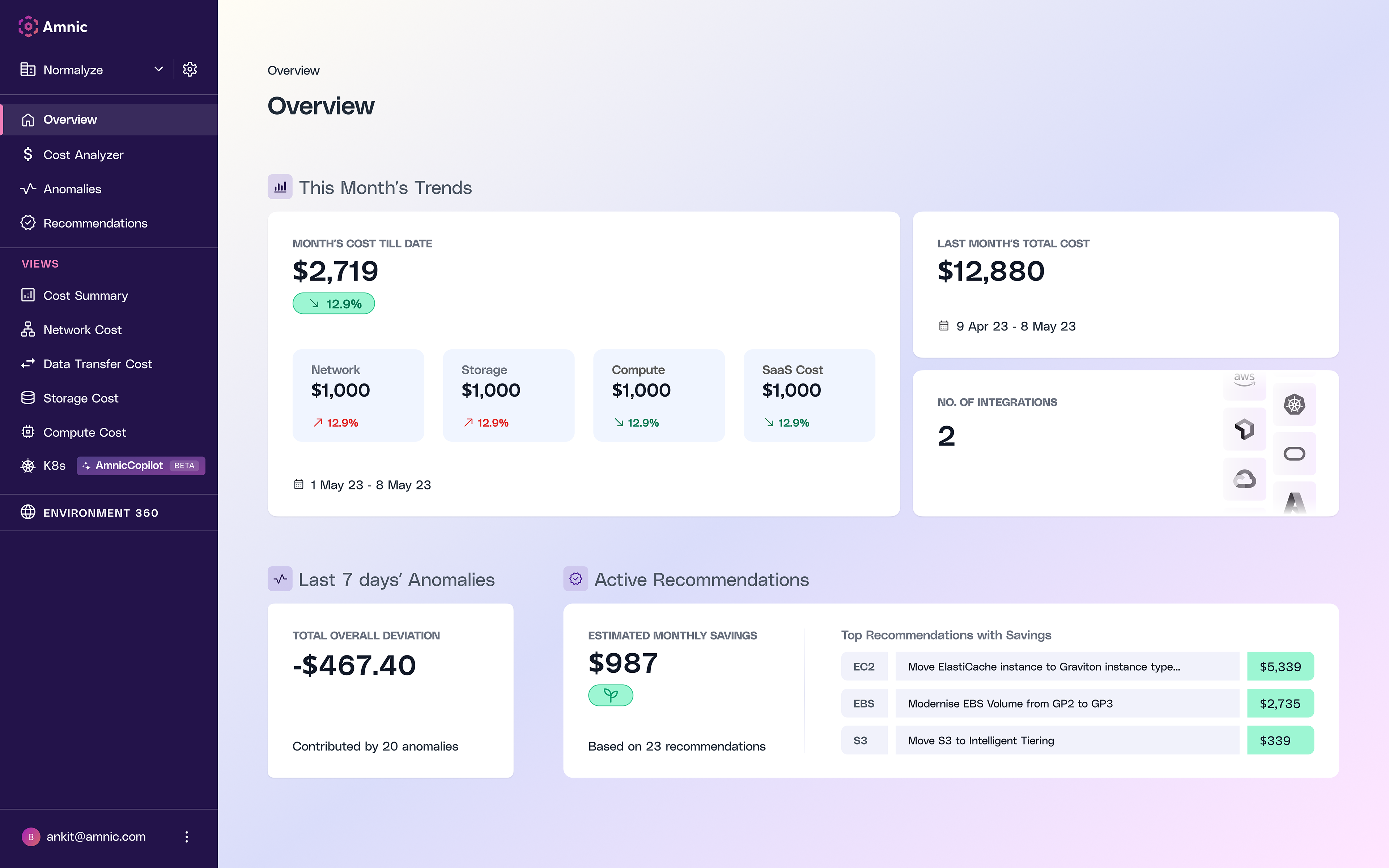
Amnic UI previously
When I started on 3.0, the overview was a fairly standard dashboard: a grid of tiles and panels with everything visible at once. It wasn't broken, but people would open it, look around for a while, and close it without having learned much.
The people using it want different things from the same screens. An engineer who owns one service, an SRE looking into a spike, and a finance lead who needs a figure for a board deck all need different levels of detail, but the same underlying story. That is the part I worked on in 3.0.
The Amnic Report
Before redesigning anything I wanted to be clearer about what the page was for. It turned out most people weren't watching their costs minute to minute. They were checking in every week or so to find out what had happened to their spending, and whether anything needed attention. That's much closer to reading a report than monitoring a dashboard.
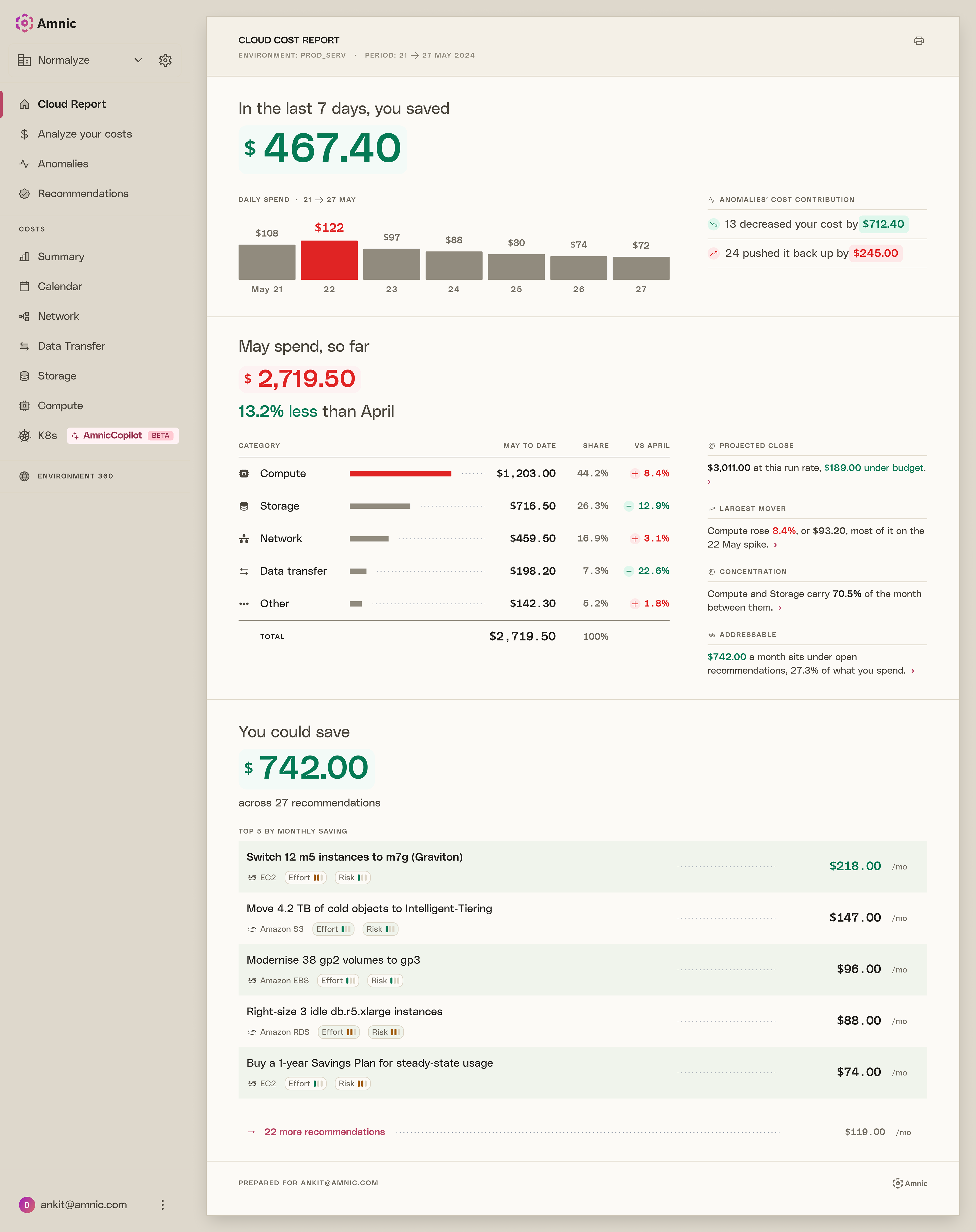
So I built it as one. The product is now shaped like a printed report sitting on a desk, with paper and ink, thin rules, a masthead at the top and a colophon at the bottom, and short notes running down the margin. The navigation is set back into the desk in a quiet grey so the sheet stays the main thing on screen.
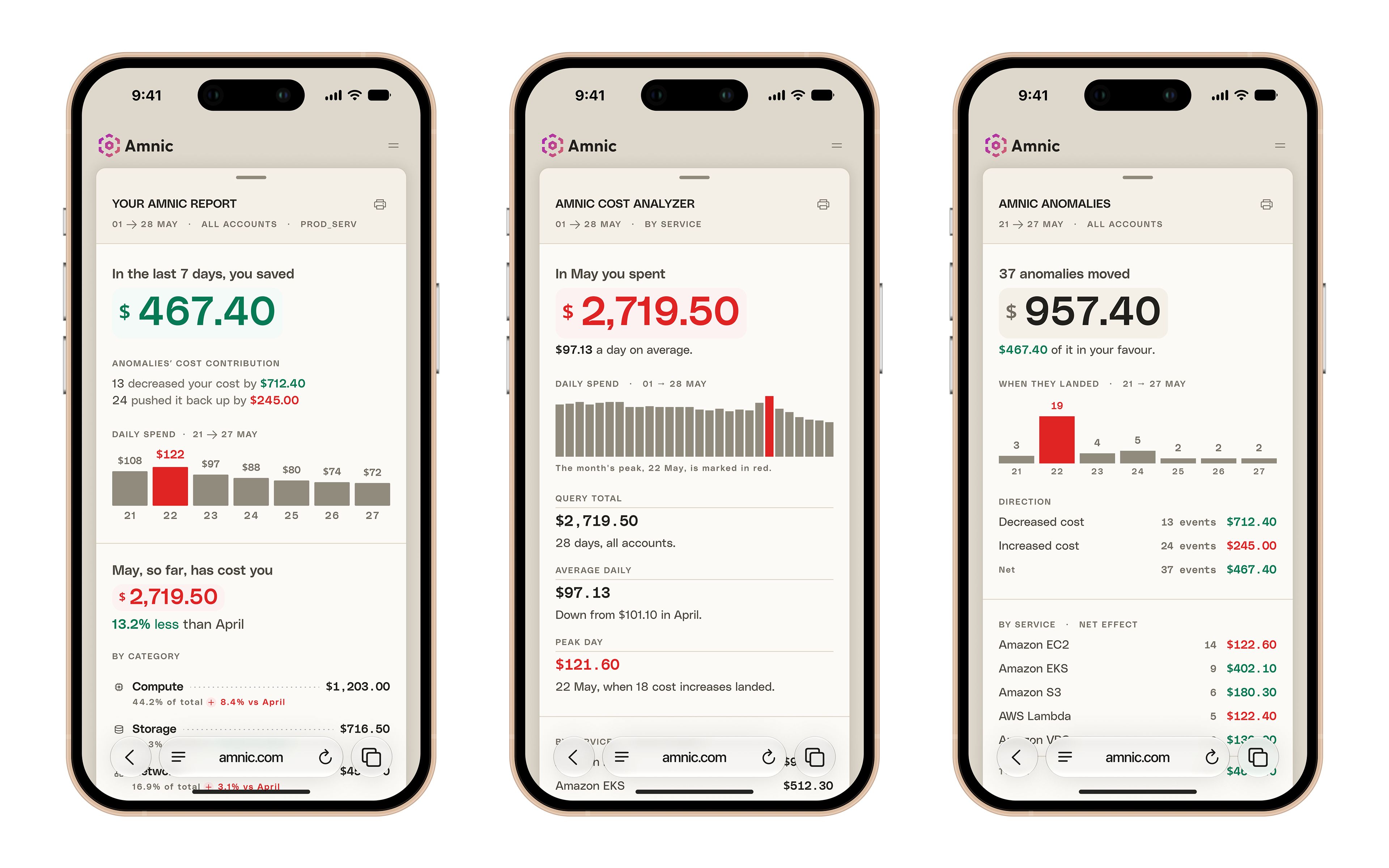
Working this way made the hierarchy easier to handle. Each section opens with a sentence and one large number, and the supporting detail sits underneath, so you can read a page in about ten seconds if that is all you need. It also pushed the writing towards plain language. A section will tell you that in May you spent $2,719.50, which is 13.2% less than April, instead of putting those two figures in separate cells and leaving you to do the comparison.
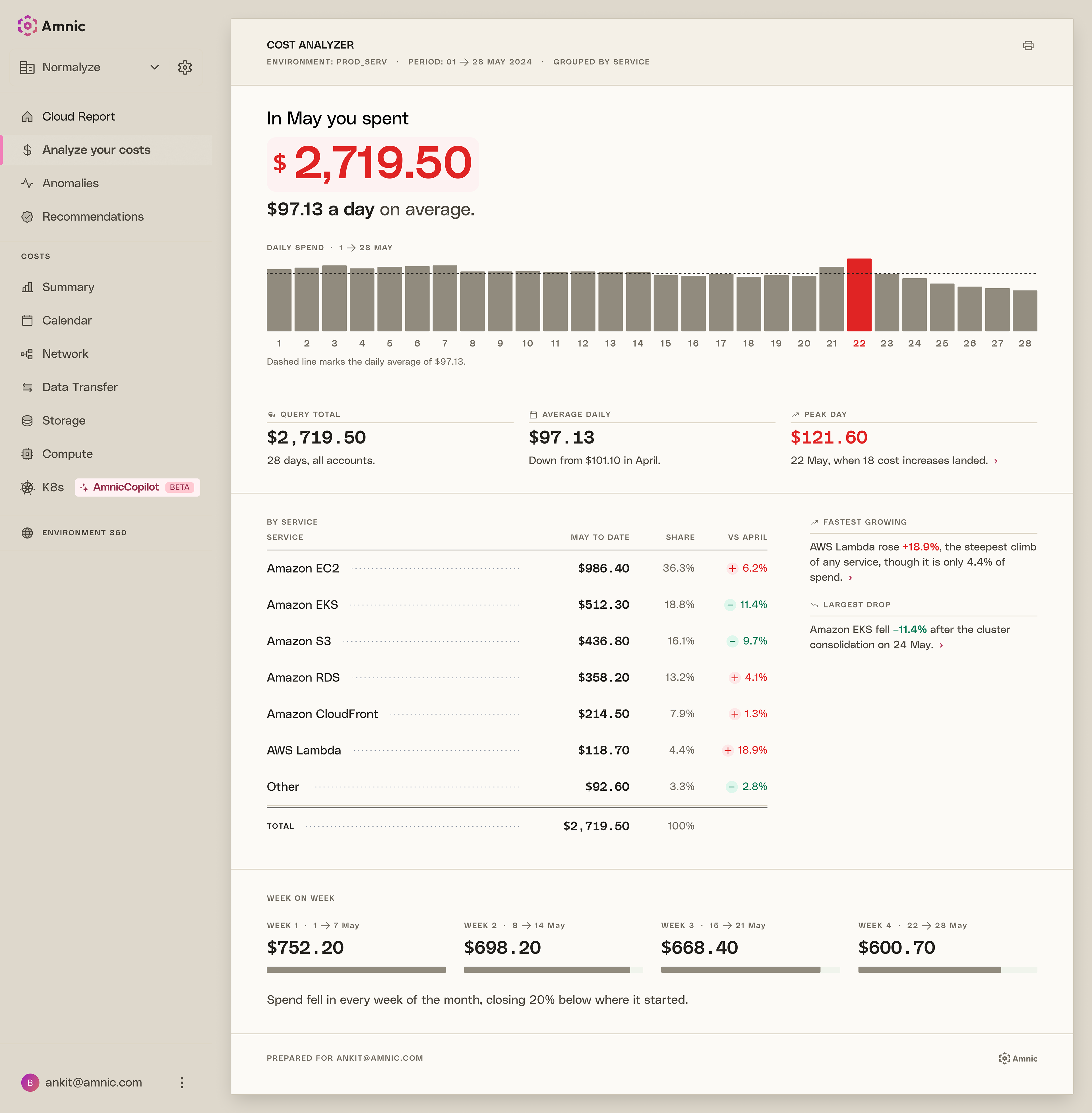
Behind the screens there is a system holding it together: primitive tokens with a semantic layer on top, a type ramp, and enough shared components to keep around thirty screens consistent across desktop and mobile. Red means money going out and green means money saved. The numbers also reconcile across every page, which took a while to get right.
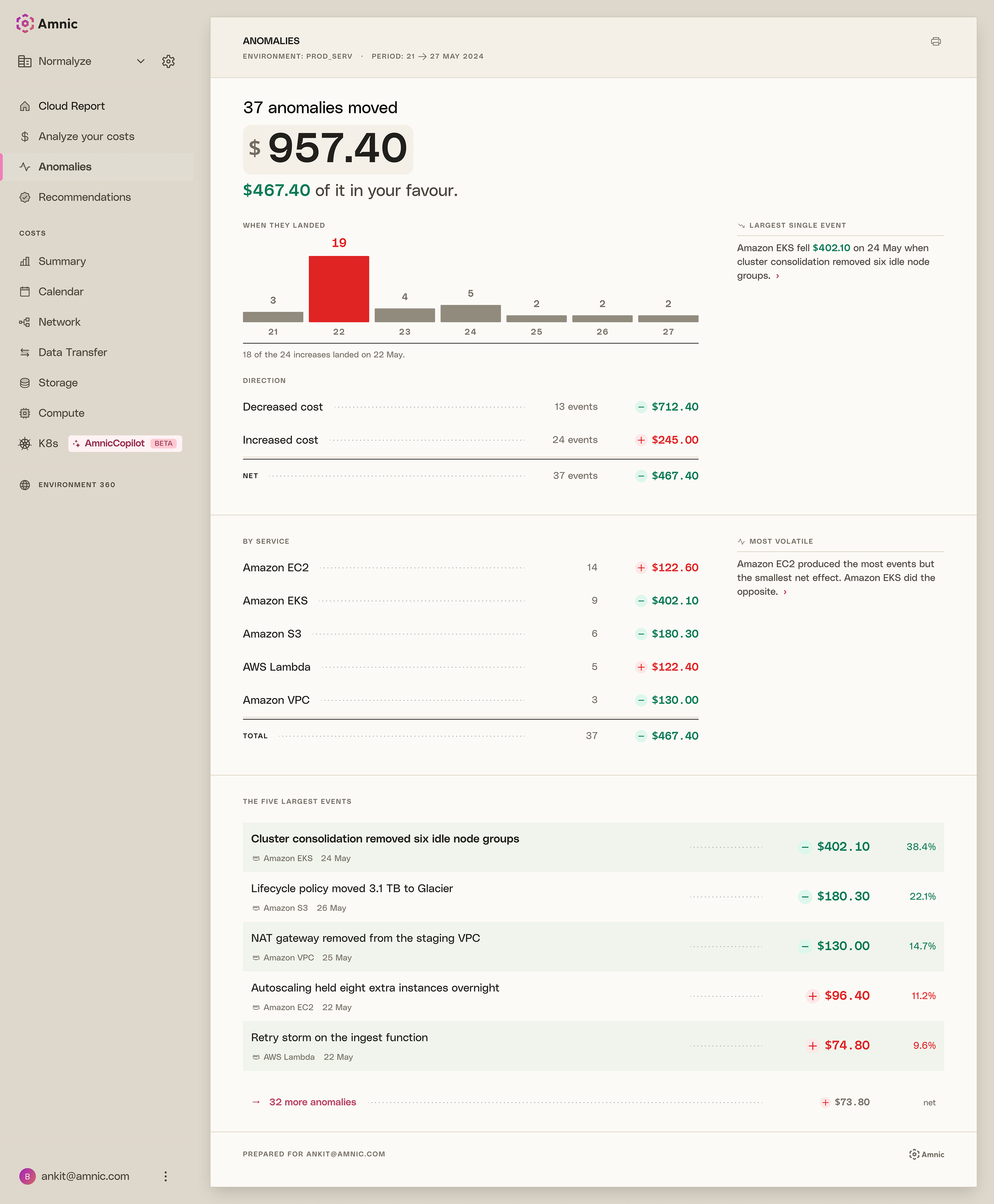
The mobile screens are the same sheet, narrowed. I didn't break the pages into cards or hide sections behind accordions, because the point of the report is that you can read it from top to bottom. Tables drop a column or two, charts get shorter, and the rest stays where it was.

Spending viewed on a calendar
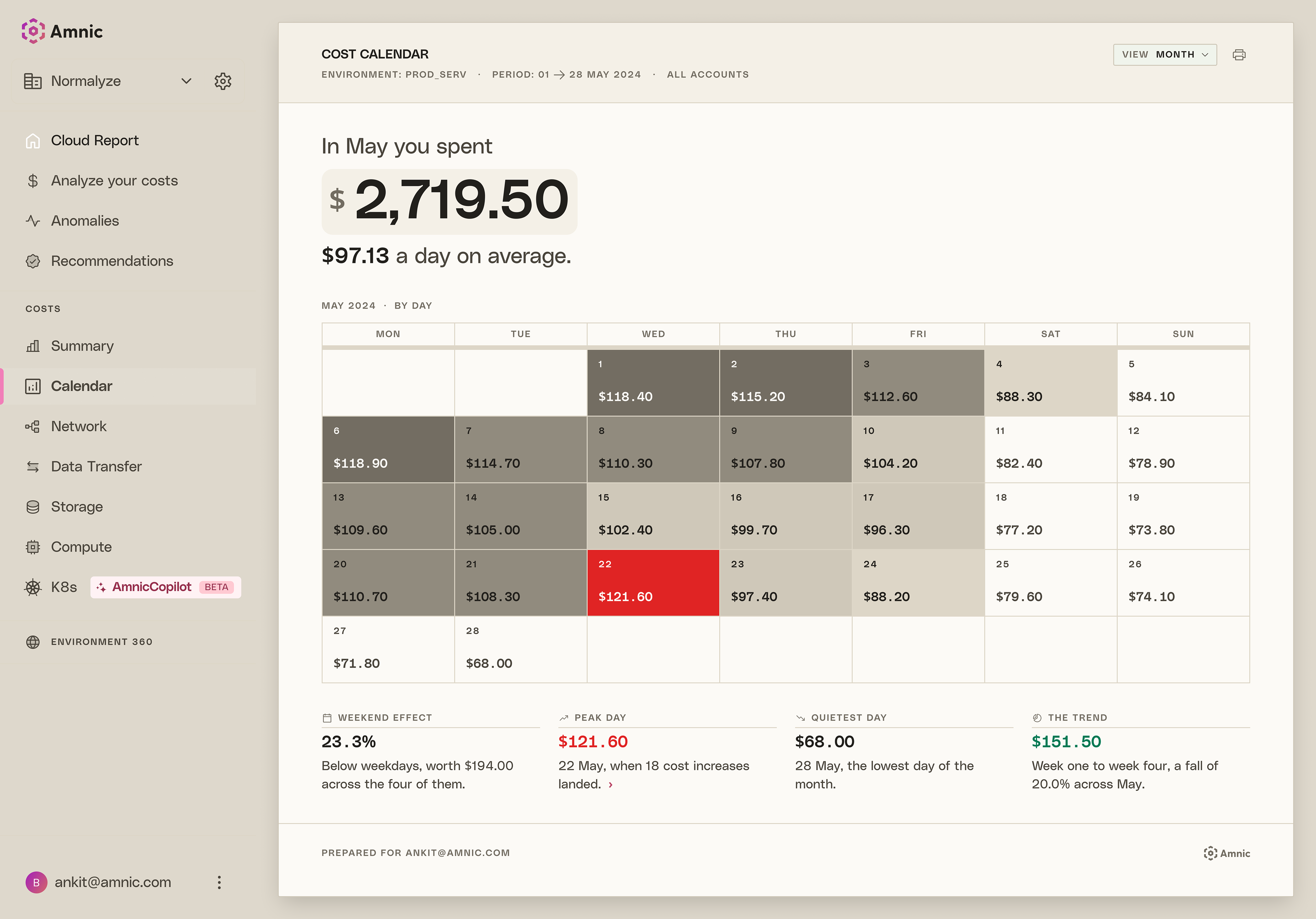
A line chart shows you that a month went up, but not that spending goes quiet every weekend, or that a single Wednesday accounted for a lot of the increase. The calendar shows the same numbers arranged by date instead of as a trend, which makes those patterns easier to see.
DAY
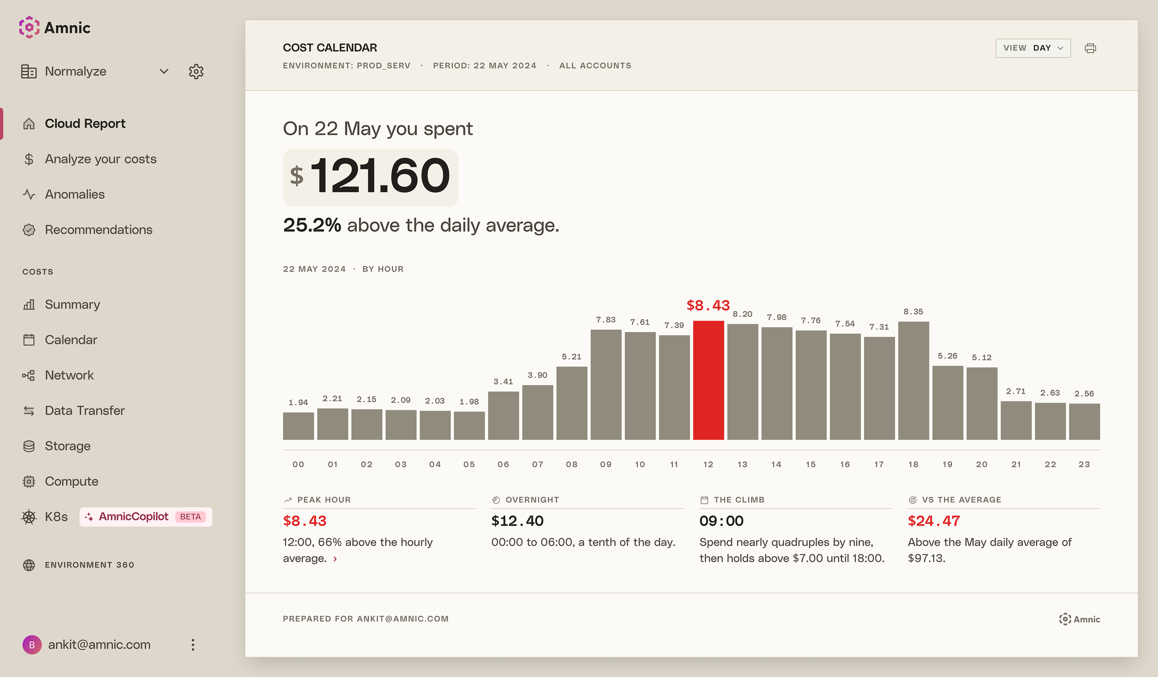
One day by the hour, drawn as bars rather than cells. At this point there is only one line of data, and bars are easier to read than a row of shaded squares.
WEEK
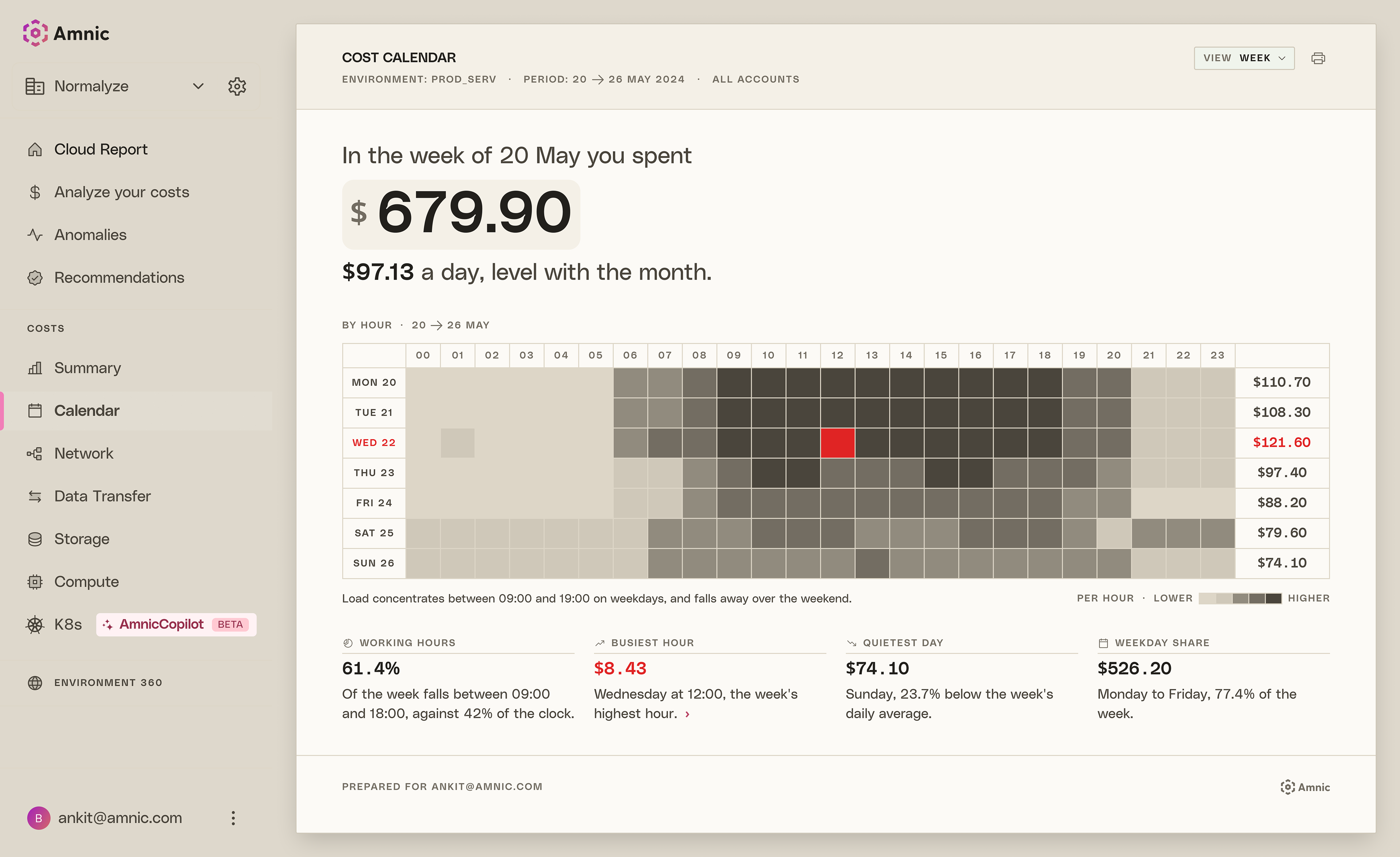
Seven days across twenty four hours. There isn't room for figures at this size, so I left them out. This view is for seeing the block of activity between nine and seven on weekdays, and how much thinner the weekend is. Daily totals sit at the end of each row.
MONTH
The same idea at a size where the figure fits inside the cell, so you get the shading and the number together. Weekends show up as two paler columns on the right.
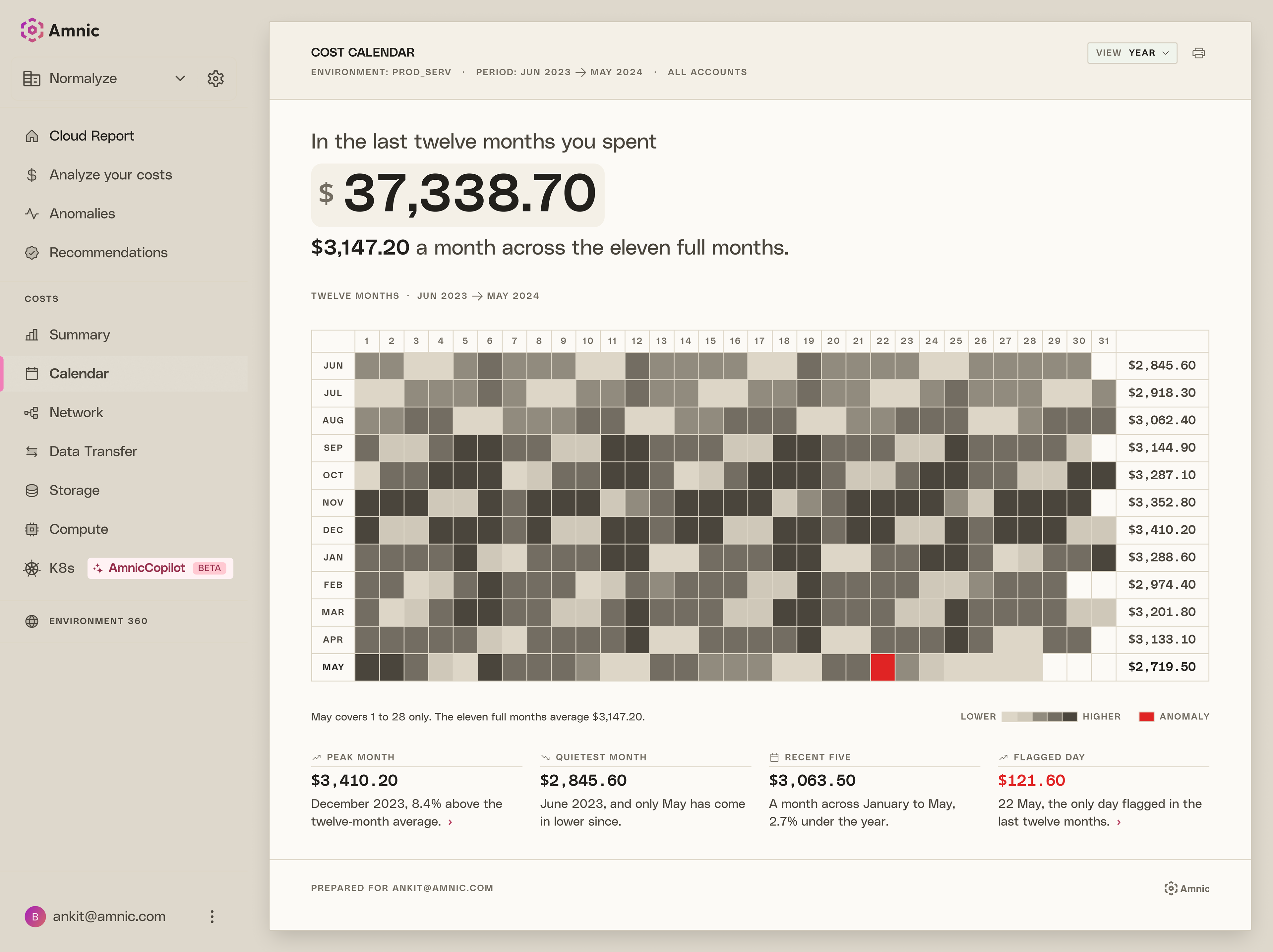
year
Twelve rows, one column for every day of the month, so a year fits on one sheet. Each cell is shaded by what that day cost, using the same bands across all twelve months, so December and June can be compared directly rather than each being scaled to itself. Month totals run down the right.
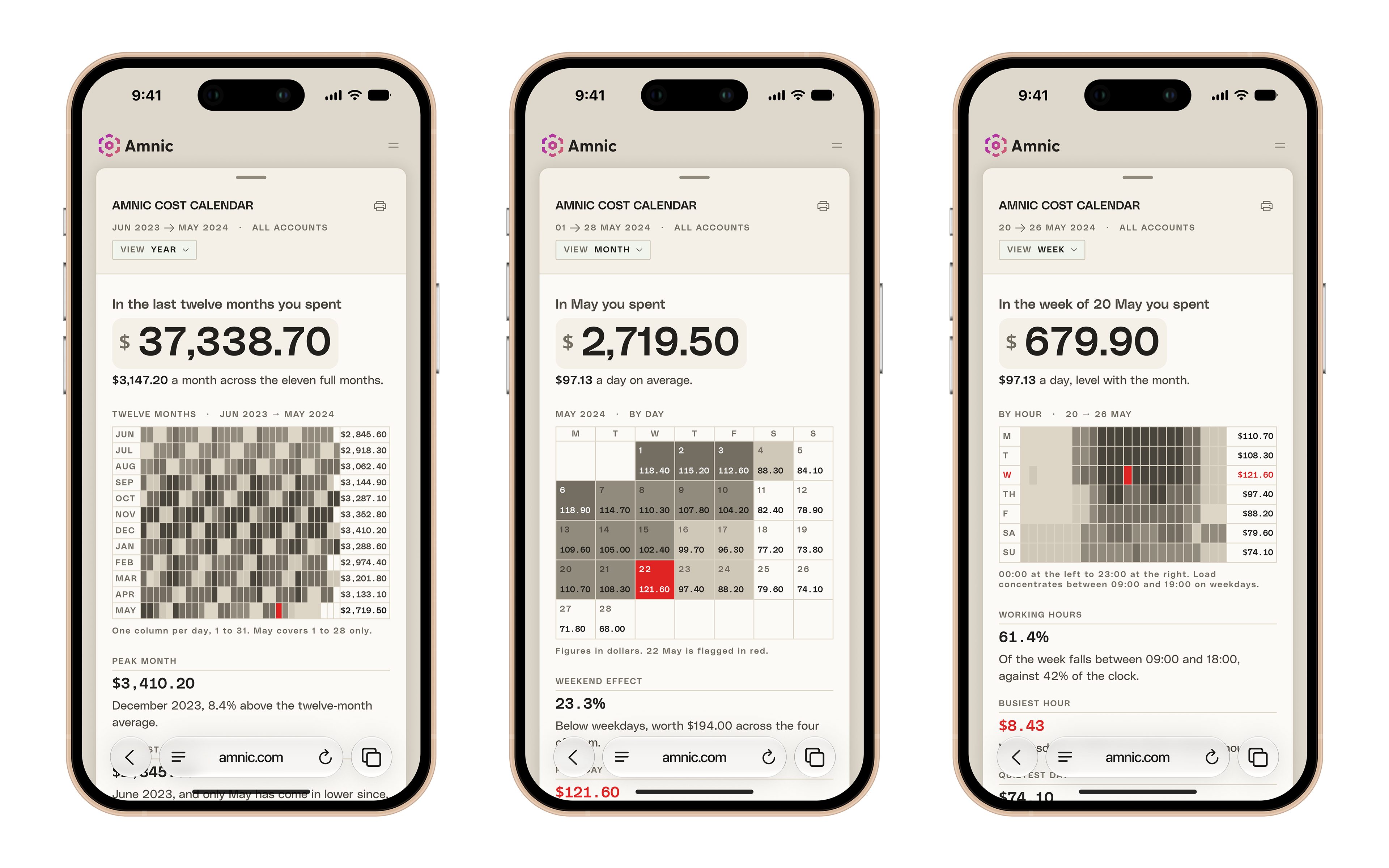
Four views of the same data at different zoom levels, from a full year down to a single day. The control in the masthead switches between them, and each view opens with a sentence summarising what you are about to look at.
Colour

All four views use tone rather than a heat map. The cells are ink on paper, getting darker as the number gets bigger, which keeps the calendar in the same visual language as the rest of the report. Red is used only for a day that has been flagged, so it means something specific rather than just a high number.