Design for high-volume blue-collar hiring
Any hiring agency can run multiple live interview rooms: an employer opens a window on a given day, a few hundred people queue on their phones, and interviewers work through them one at a time at about four minutes each.
I redesigned both sides. The employer side is a desktop tool for looking at who applied, scheduling a room, watching the rooms in progress, running the interviews and handling what happens after a decision. The candidate side is an Android app in Hinglish, used standing in the street on a weak connection and a low battery.
A room runs for seven hours and sees about three hundred people. Most of the decisions here come from that number: what an interviewer can hold in view while making a call every four minutes, and what a candidate can usefully be told while standing in a queue.
Managing the volume
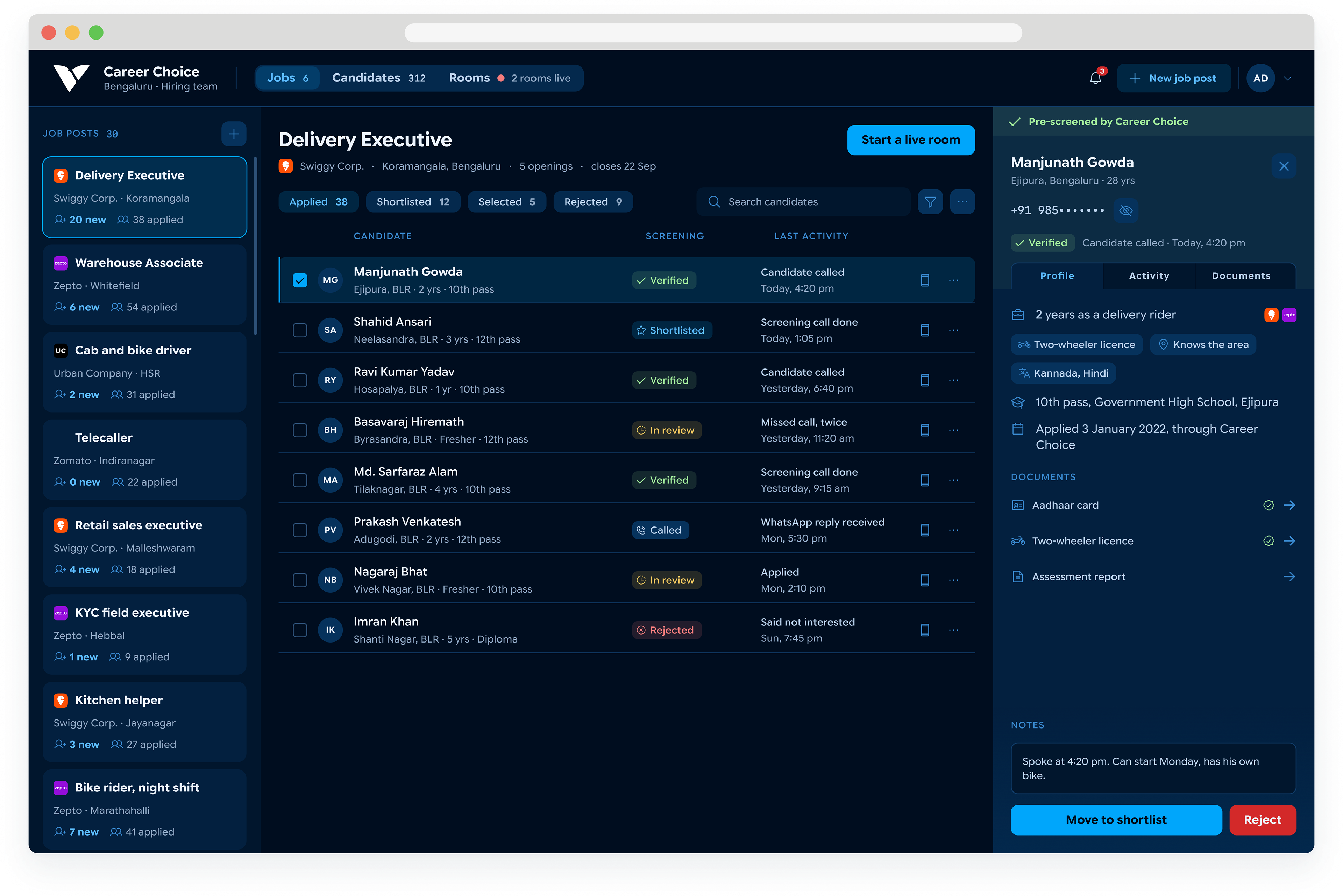
The main problem for hiring agencies is the volume of candidates that apply to jobs. Blue collar jobs have a lot of people switching often, so going through candidates' lists and filtering quickly is a key requirement of browsing.
setting up a live room
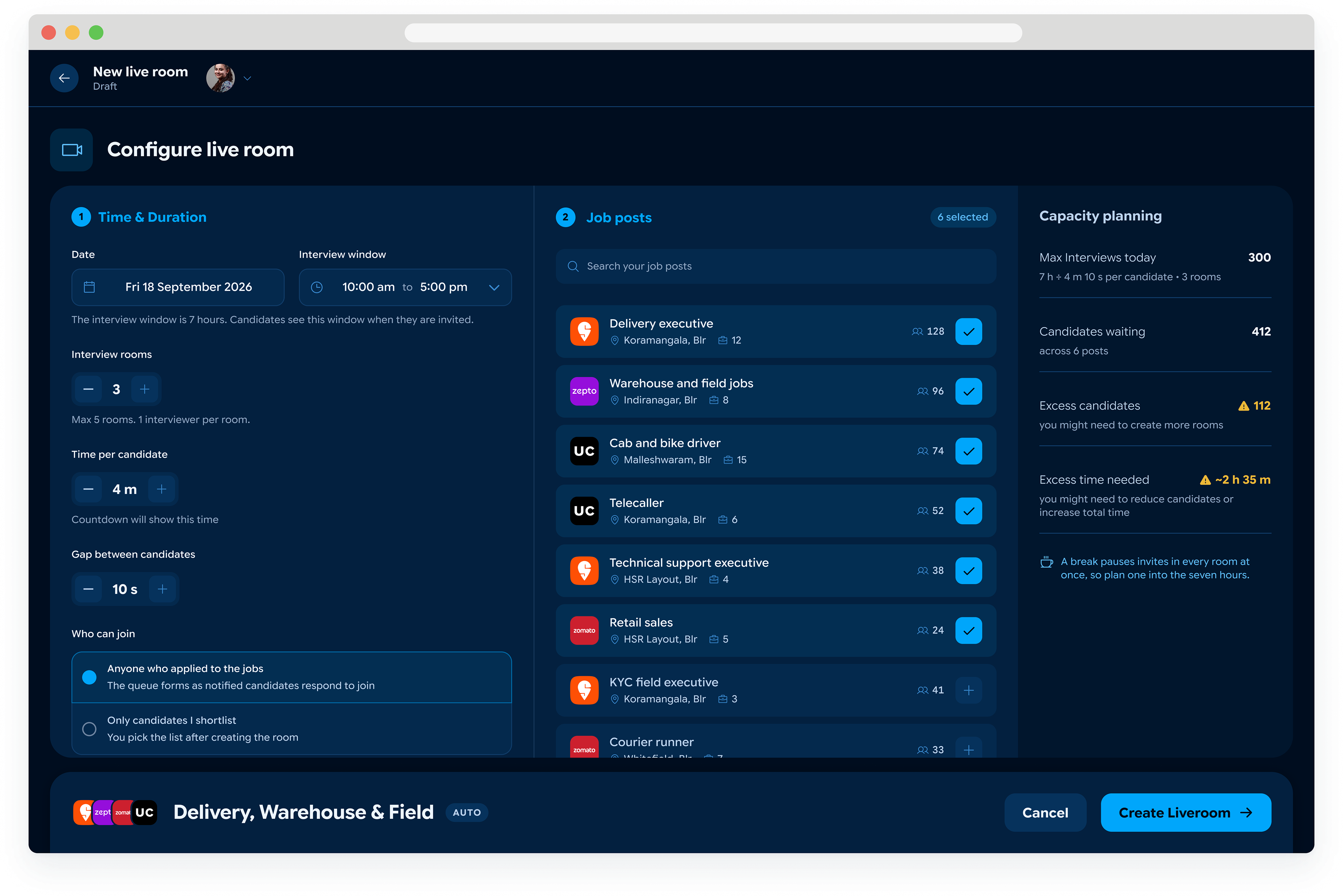
An employer picks a date, an interview window and the job posts they are hiring for. The screen divides the window by the time allowed per candidate and the number of rooms, and states how many people can actually be seen. Against 412 people waiting across six posts it says the room is 112 short and about two and a half hours under. An over-subscribed room gets caught here rather than on the day.
Getting into the room
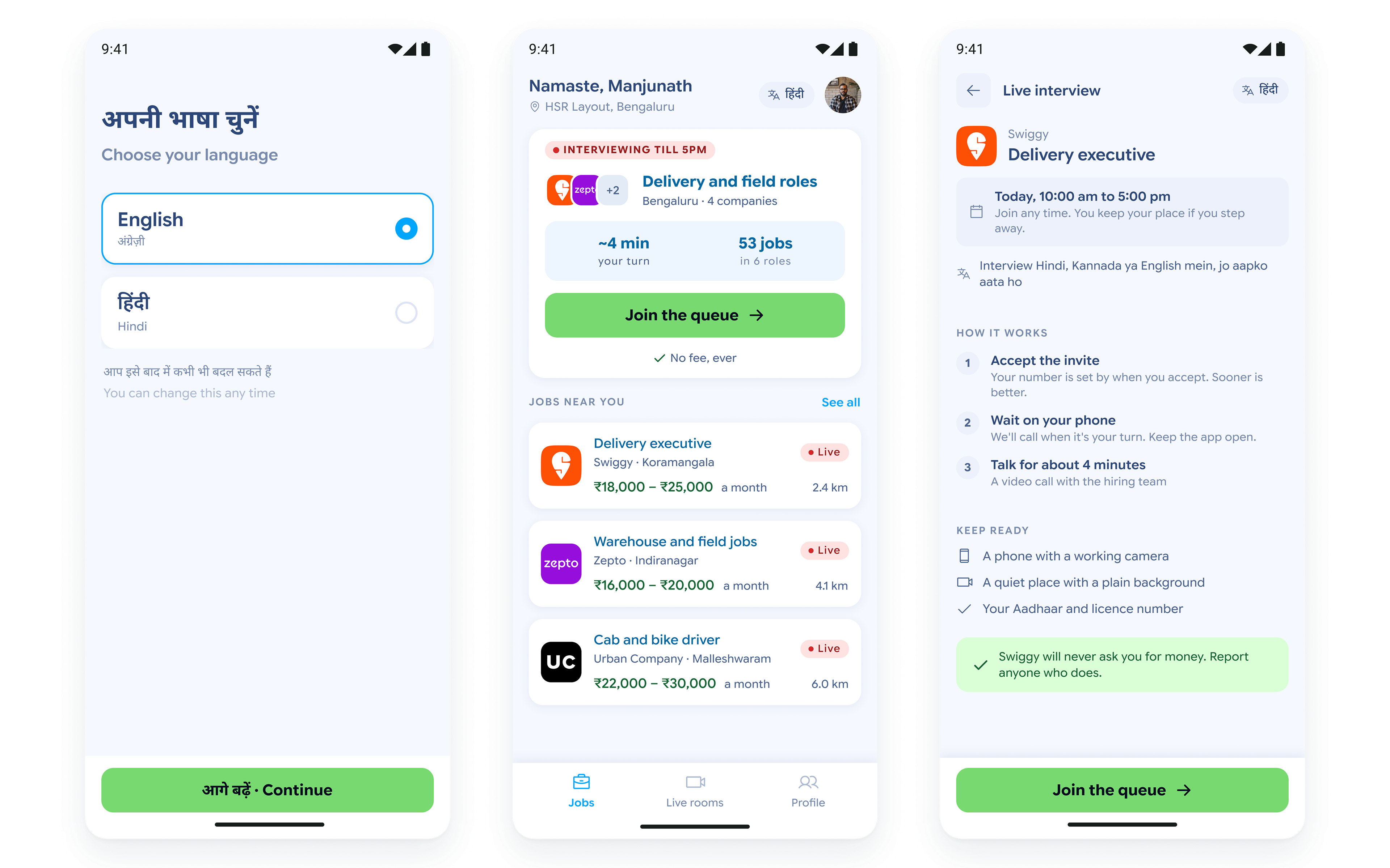
The candidate side is a light Android app in Hinglish. It opens with a language choice, because the interview itself can be in Hindi, Kannada or English. A live room appears on the jobs home as something happening now, with the brand, the role and the window stated before anyone commits to waiting.
Waiting in queue
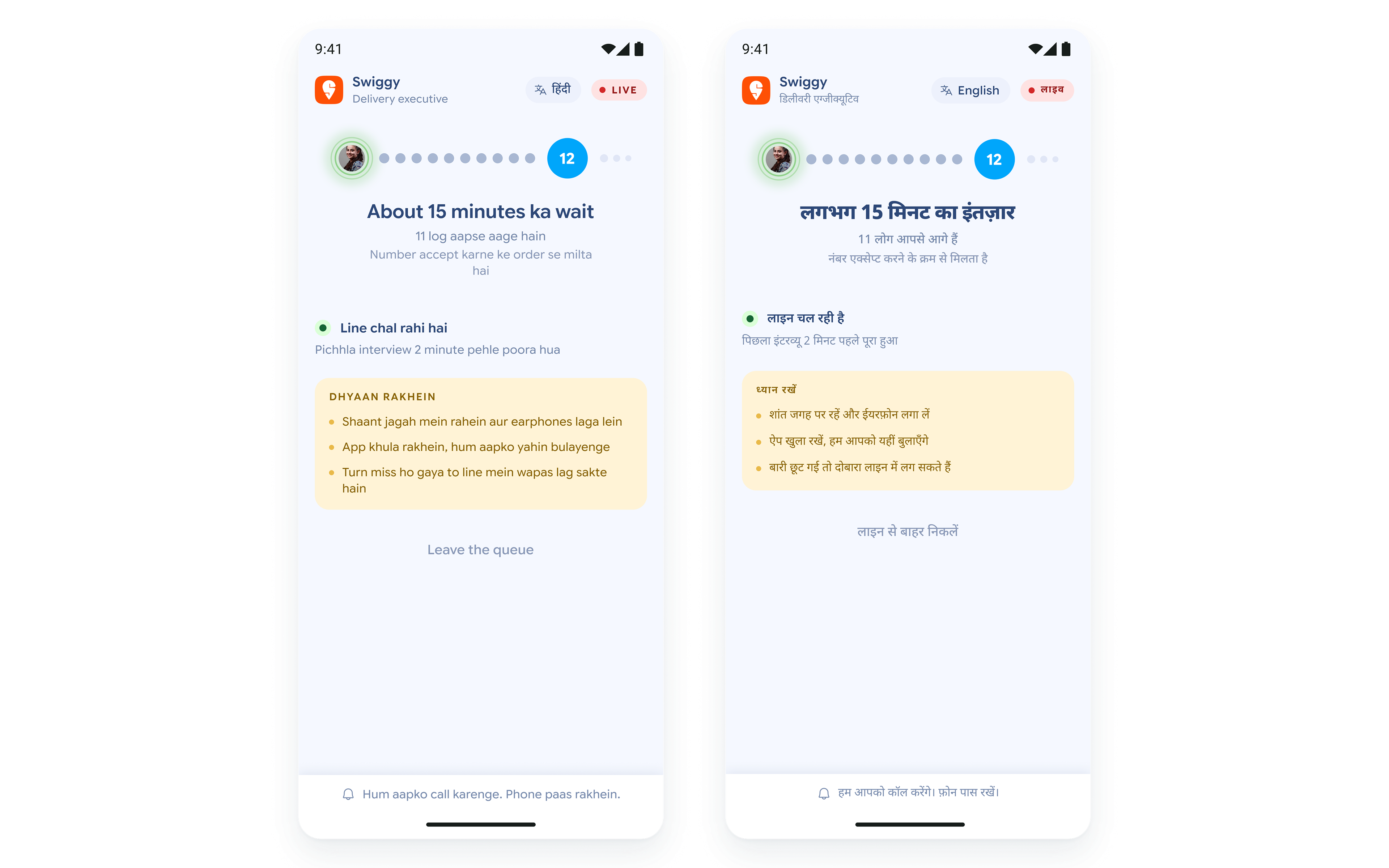
Most of a candidate's time in a live room is spent waiting, often standing somewhere with a weak signal and a low battery. The screen keeps saying how many people are ahead and roughly how long, and updates as each interview finishes. Leaving the queue is on the screen, and so is the fact that a missed turn goes back in line rather than being lost.
Your turn
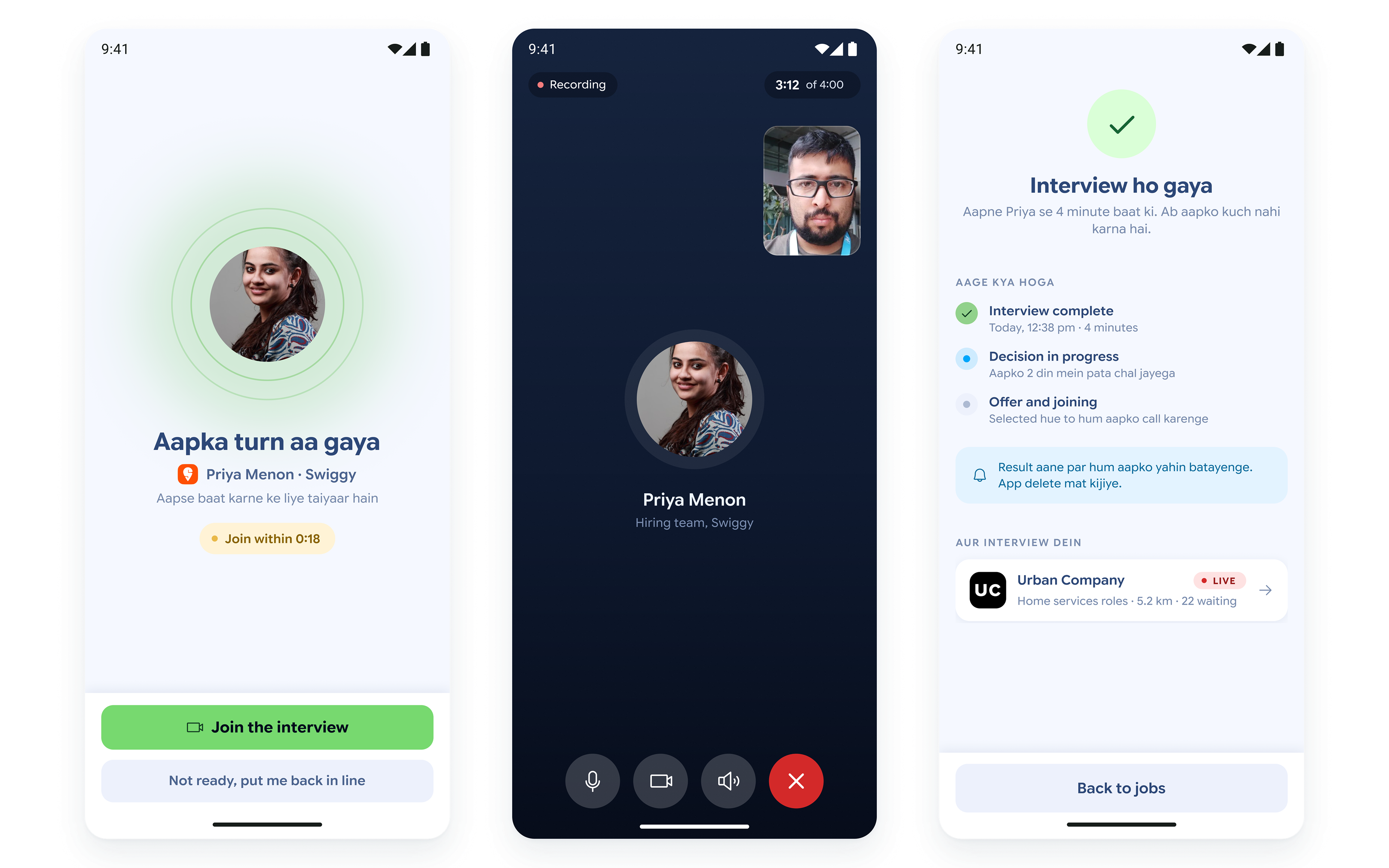
A turn comes with a short window to join and the screen says how long that window is. Anyone who misses it goes back into the queue. The interview itself is one call with nothing on screen but the person and the time remaining.
live rooms for interviewer
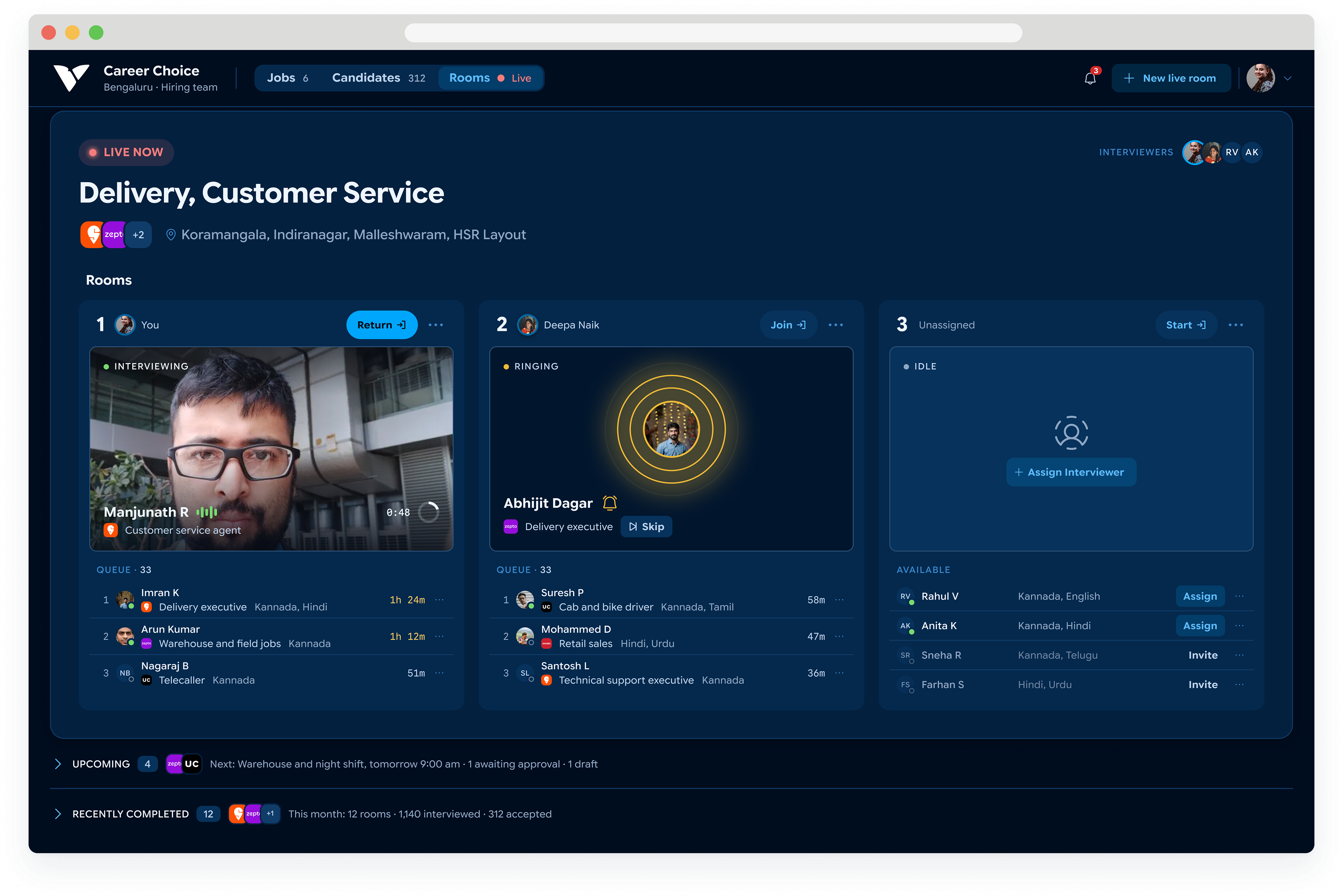
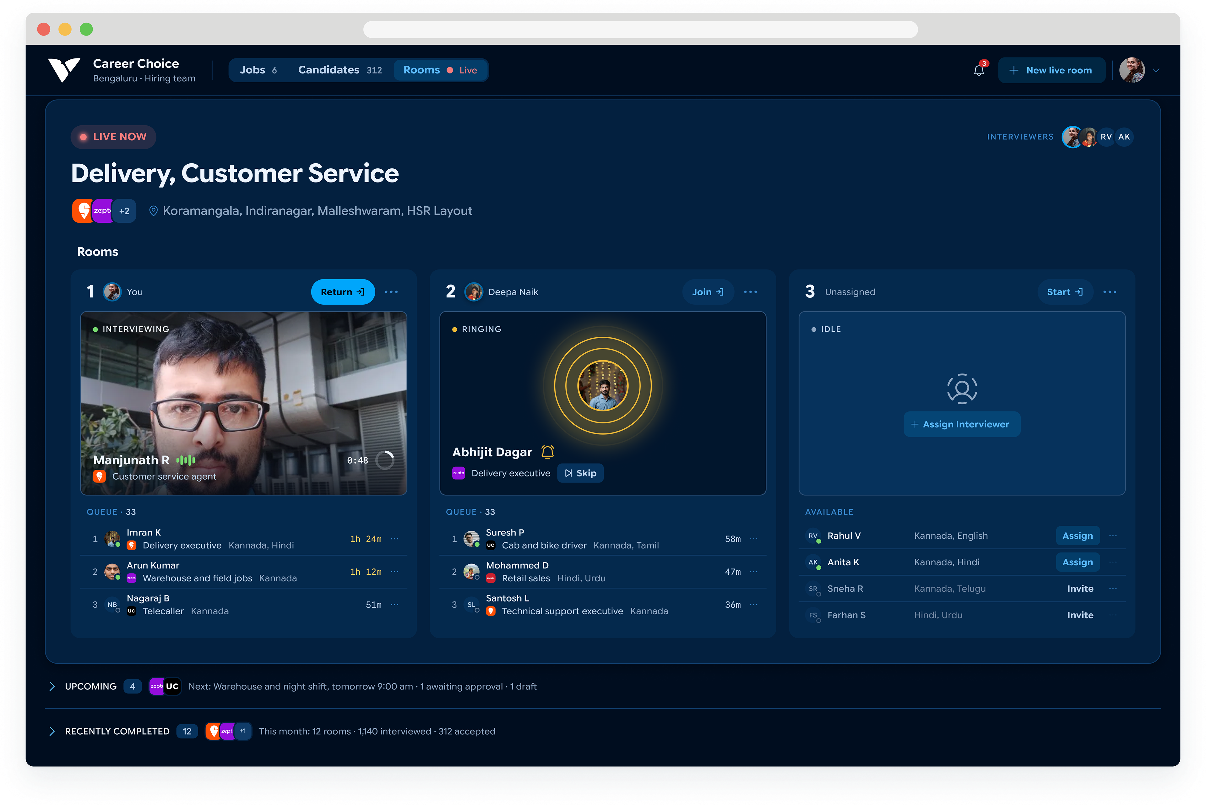
The home screen is a live view of the rooms in progress. Each column is one interview room: who is on camera, who is next, how long each person has waited. Rooms that are idle or over capacity surface on their own rather than waiting to be found.
the interview room
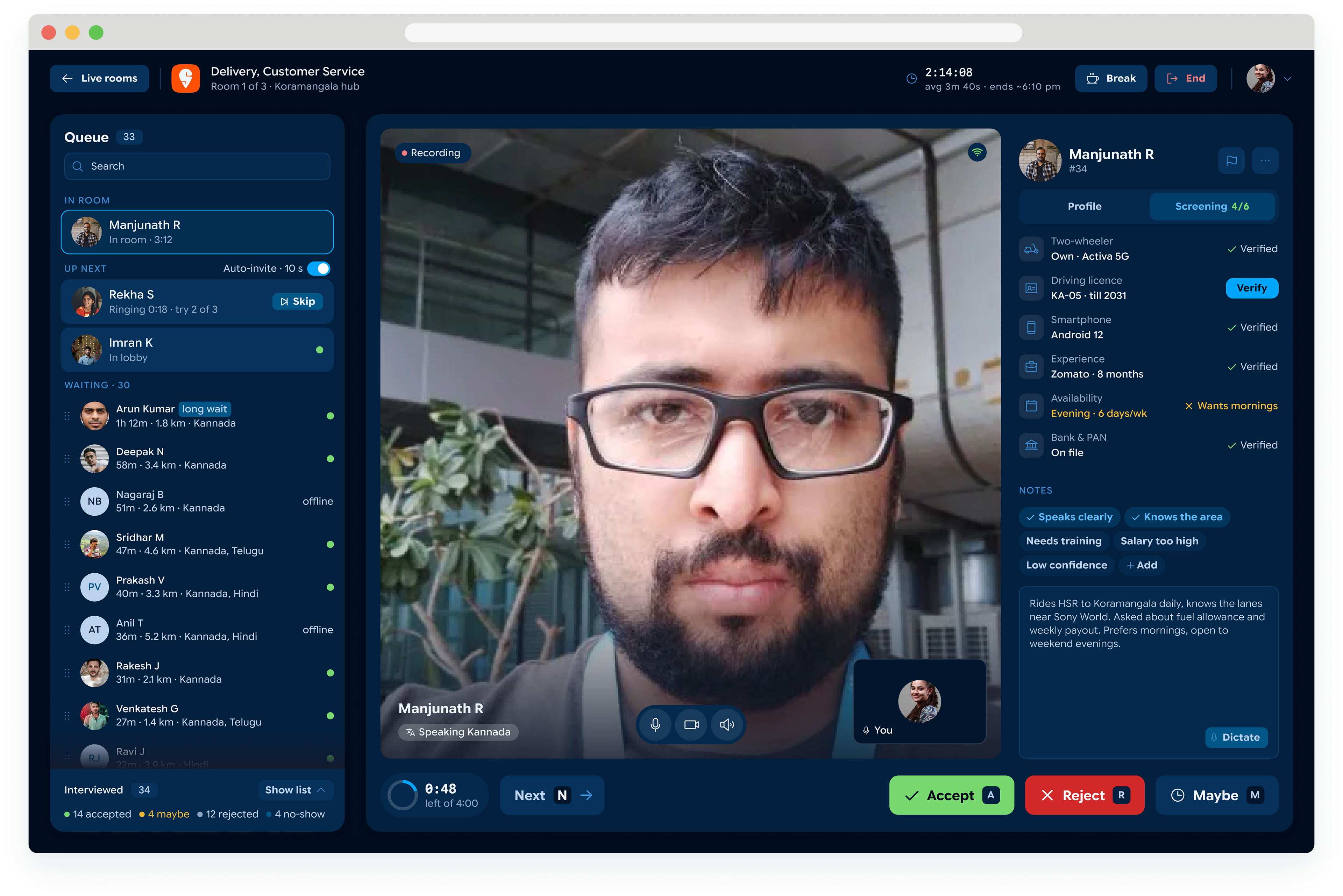
The interviewer sees one candidate at a time, the queue on the left and that person's verified details on the right. Accept, maybe, reject and next are the four controls, each on a single key, because the work is making the call and moving on. The header carries elapsed time, the average so far and the projected finish, so a room running late shows it without anyone doing the arithmetic.
managing candidates
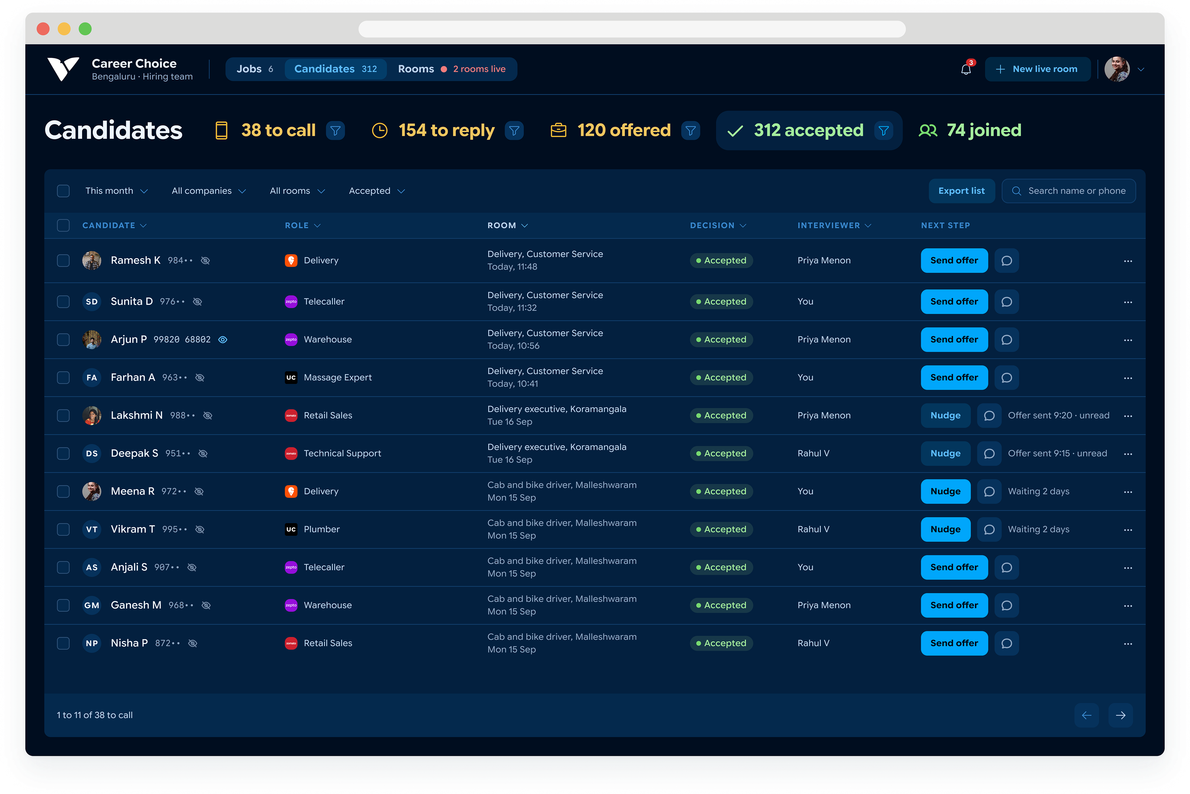
Accepting someone is not the end of the work. This screen holds everyone who got through, grouped by how far they have got: to call, to reply, offered, accepted, joined. Phone numbers stay masked until someone chooses to see one, and the next step goes to the candidate's own app rather than being dialled from a desktop that cannot place calls.