A Consumer-grade Experience for Cloud Orchestration
Product Designer • 2015 - 18
Problem Statement
Setting up and managing the cloud for an enterprise gets inevitably cumbersome.
CALM aimed at adopting a visual approach to make this job easier.
My contribution
As the only designer managing all the aspects of design for CALM, I made a significant difference to CALM by:
1. Shaping the product and the processes
2. Resolving visualisations of the key components in the system
3. Defining a design system
My Role
• User research & interviews
• Design critiques with the team
• Low-fidelity wireframes
• High-fidelity mockups
• Testing prototypes and product with users
• Engineering handoff
Outcomes
1. CALM got acqui-hired by Nutanix soon after the redesign with a high praise for the UX and visual design.
2. CALM and its design system got patented. I'm a co-owner of the patent.
G L O S S A R Y O F T E R M S
Service Also known as an application. This is the bundle of code that is deployed to the cloud
Substrate The cloud provider on which the application runs
Service tasks Purposeful tasks defined for running on the infrastructure or specific services for varying purposes
Blueprint A topological map which comprises of relationships between services and the tasks which run on them
Dependencies Relationships between services defined by exchange of data between them
Application Profile A profile which decides the cloud on which the application/service will be deployed
Flow A set of tasks that can run across services
Diving into the community and the complexity
Starting with research
My first aim was to understand the cloud and the problem scope in detail. For this, I started gathering knowledge and perspective from within team CALM. Additional to that, I conducted my own secondary research online, with knowledge in abundance.
So, I also started to reach out into the industry to meet DevOps professionals at large corporations. This, I managed through my existing network and by joining DevOps groups online. I not only wanted to gather knowledge from them but also to show them the existing CALM and get their feedback on it.
CALM's 3 user personas
1. The DevOps: The DevOps personnel is the one who sets up and manages the virtual infrastructure for the enterprise. Typically a master in computer applications, this person has knowledge very specific to the context of cloud. This is the person who creates the infrastructure blueprints.
2. Technical owner: This could be the lead developer on the team, who is leading the software. Typically a software engineer who is proficient in languages and technical details that have to do with tying together the pieces of the virtual infrastructure.
3. Business owner: Typically someone in a leadership or management role. This person is likely to not have detailed information about the code or packages being deployed but intends to spin up infra using the Blueprints that the DevOps would have created.
Testing the existing CALM
When I joined team CALM, it was in its very first version.
Along with research and interviews, I started to test this existing version. Feedback from DevOps experts in the industry became instrumental in shaping the next version of CALM. It started to move me towards many questions and answers/insights into shaping it better, not just incrementally but from a ground-up approach.
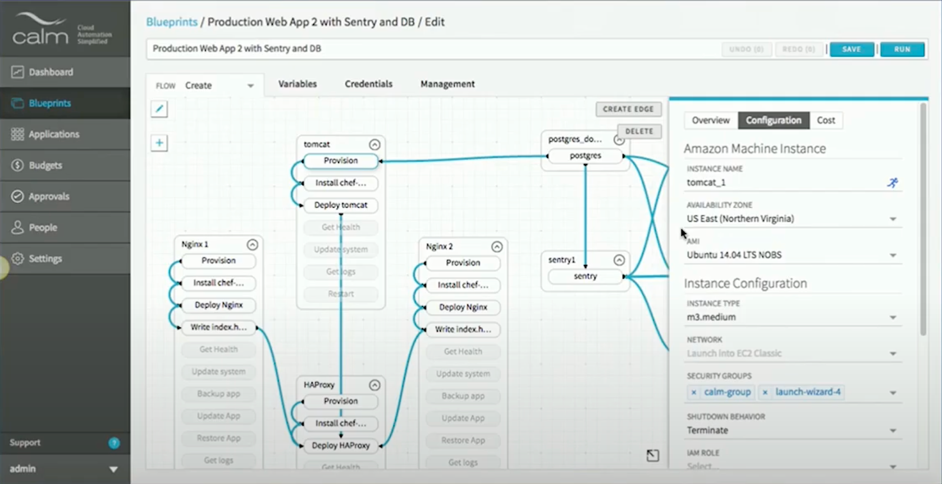
Screenshot of CALM v1 showing blueprint of an app comprised of services and a 'flow' created across them. On the right hand side (pane) is shown the configuration of a service.
Discovering problems
Through testing CALM v1, I gained some key insights which became instrumental in shaping my work going forward:
1. Users were confused about the mode they were currently in - whether they were editing a blueprint or monitoring their infrastructure. The reason for this was that the exact same visual environment was being used for blueprint creation as well as monitoring deployed infrastructure.
2. Substrate and Service definition and relationships were unclear. This resulted in confusion in the process of blueprint creation.
3. Service definitions and the functions' task lists were merged visually, so the representation of the service on the blueprint canvas wasn't clear.
4. Service dependencies and service task flows (flows) were illustrated using arrows styled identically.
5. There was fatigue for the user in the interface, due to the controls for objects on canvas being docked away in a corner.
Ideating & bucketing solutions
The issues discovered in the testing sessions got self-categorised into 2 buckets of problem areas:
Representations
The representations for the key components and contexts in the system needed resolution. If the representations matched users' mental models, it would take away a lot of cognitive load.

Workflow
A visible and standard workflow was needed to streamline the creation of all the components of the blueprint.

Representation
Setting the contexts at a high-level
Testing CALM's v1 revealed a major high-level problem: that while switching between the 2 contexts of blueprint creation and application monitoring, users were confused as to where they were positioned exactly. This compelled the need for a clear visual distinction between these 2 contexts.
In the v1, these contexts were 'loosely' referred to as 'Blueprints' and 'Applications'. Since these are 2 environments that the users works in, I took the 2 mental models into naming the contexts as:
The Blueprint Designer
This is the environment wherein the blueprints would be defined/drawn. The Blueprint Designer adopted the blueprint sheet/paper as an infinite canvas on which the infrastructure could be 'sketched'.

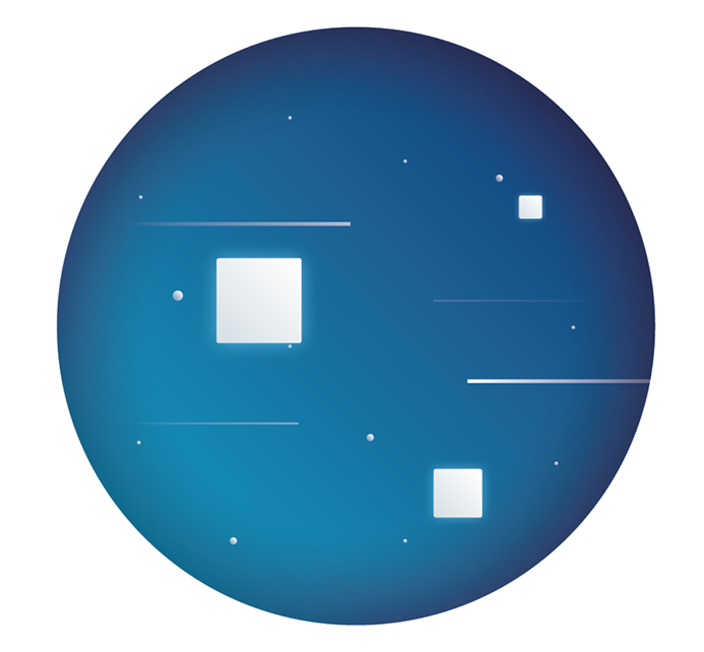
The Deployment Console
This is the environment (glass pane) wherein the deployed infrastructure could be monitored. The visal design for the Deployment Console begged the eternal question: 'Where is the cloud?'. Amongst many answers, the simplest one was 'sky' or the infinite space, and hence, space became the container for the virtual infrastructure.
Representation
Resolving the service definition
At the outset, the canvas allowed the users to define services, tasks that would run on them, and, configuration for the cloud that they could be deployed on. However, these 3 pieces of information had been bundled up together on the canvas and that made it difficult to navigate visually.
This became one of the breakthrough challenges for the design of CALM.
A key problem that was exposed in the blueprint design context was that the users were unclear about the object they were dealing with, on the blueprint canvas. The concepts at-hand were (see image):
a. Service
b. Cloud (Substrate)
c. Workflow tasks

Conceptual illustration of the initial state of the canvas object
a
The visual of the service on the canvas displayed a name and service tasks. The object was a complex composite.
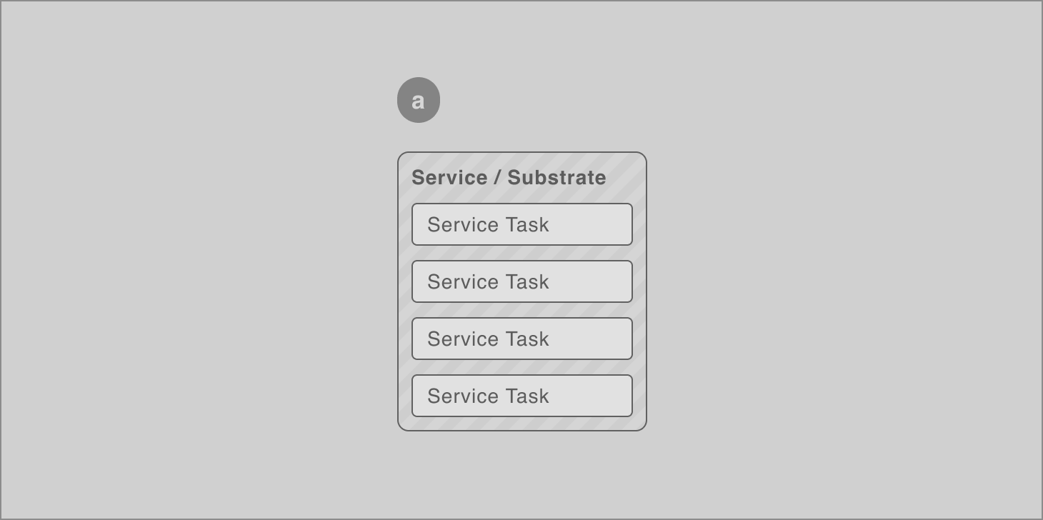
Initial state of the service object on the blueprint canvas
b
To move towards a better visualisation of this object, I began by rough visualisations of the concepts packed inside the initial visual.

Identification of concepts inside of the initial composite object
c
The visual was further resolved in 2 steps:
1. Separating the service from the service tasks, and,
2. Identifying that the service being of primary importance, needs to be the featured object on canvas
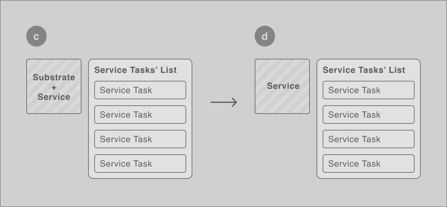
Separation of the concepts based on the mental model of users
Representation
Layering of the substrate and service
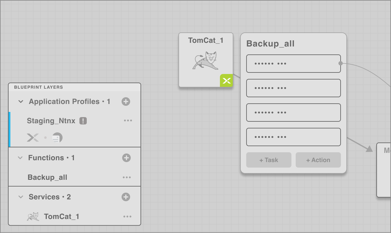
An integral need of the design of the service object was to represent the substrate (cloud) it would be deployed on. This was necessary to be indicated since application/service profiles allowed multiple crowds to be configured inside the same blueprint for choice at runtime.
The premise for substrate representation
This representation came to be informed by the fact that the service indeed is deployed 'on' or 'runs on' the chosen cloud. In this sense, the substrate or cloud forms the bedrock of the service(s).
Further visual resolution
From the above diagram, it is clear that an expansive area to display a chosen substrate would've been rather bulky for the screen, hence this got further simplified.
The conceptual layering of substrate and service came together to combine and display the layer of the substrate in a peeking window on the bottom-right of the service.
The final result
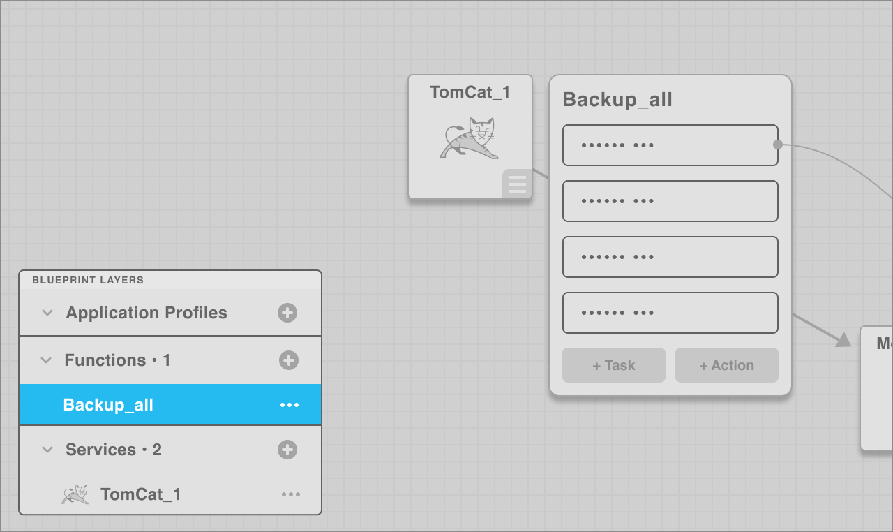
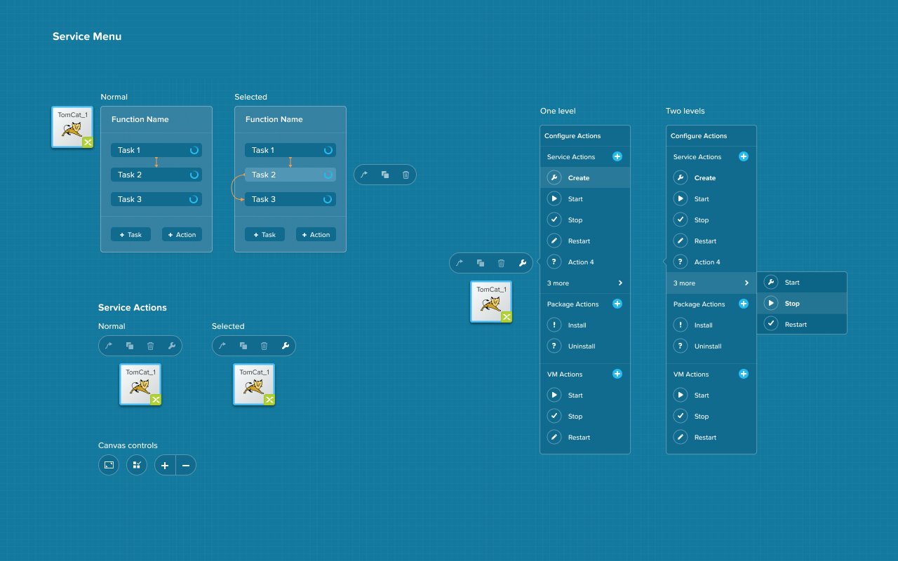
The task list later expanded into not just enabling users to add a Task but also existing service actions into the list. Here's how the final result looks:
How the empty state an configured state of the service with tasks appears on canvas
An array of services
One of the key features of the cloud is scalability.
This manifests technically in the form of an 'array' of services, which is basically a service replicated. This could be for a variety of purposes.
To represent an array, I created a variant, which indicated multiples and duplicates.

Representation of an array of services (An array service)
Representation
An interim exploration for service design
When I started the redesign exercise for the blueprint designer, we zoomed out of the current methods and discussed 2 concepts for the representation of service substrate relationship. I created quick wireframes for these 2 broad approaches and discussed the pros and cons with the team. These were:
Service as a 'block'
P R O S
1. In-line with the version 1 that customers were using
2. Simpler in representation
3. In-line with the concept of the 'box' (VM)
C O N S
1. Visually mundane

Service as an atom
P R O S
1. Visually innovative and out-of-the-box
C O N S
1. A scientific concept as a metaphor might need explanation/training
2. Visually complicated to manage
3. Difficult to work with, given the context

I was initially quite attached to the atom concept, I got overwhelming feedback from the team that the concept of the service as a box was simple, given the other objects around it, such as the task list. So, I agreed and moved on to build on the chosen system.
Representation
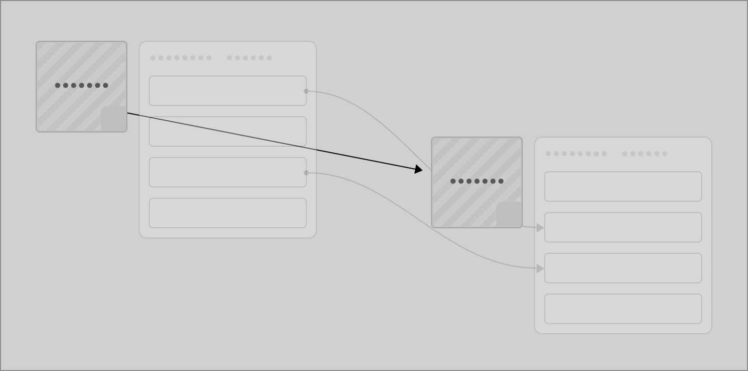
Resolution of relationships and flows on canvas
In a service/application blueprint, there are 2 key aspects which need to be depicted:
a. Dependencies between machines and,
b. Task flows between and across them.
For both of the above, CALM v1 uniformly employed an 'arrow' element, which proved to be confusing, when the v1 interface was tested with users. Below is an illustration of the issue:
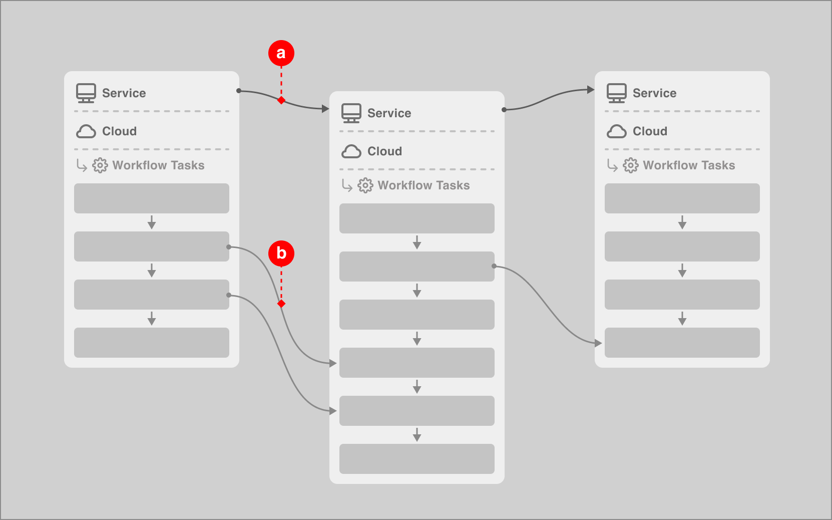
How the dependencies (a) and flows between service tasks (b) were initially represented
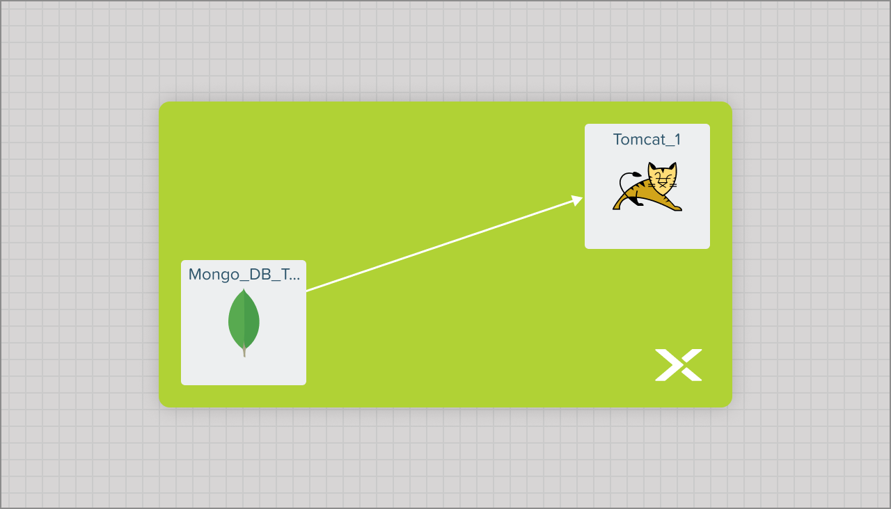
Solution 1 • Dependencies
The first level of connection in a blueprint is the (inter)dependencies between services.
I identified that the dependencies between services is a 'direct' one which made me employ a straight line for representing this.
Redesigned service-to-service dependency representation
Solution 2 • Flows
'Flows' are defined between tasks across services.
They represent the movement of defined actions across services hence a bezier curve fits the mental model easily.
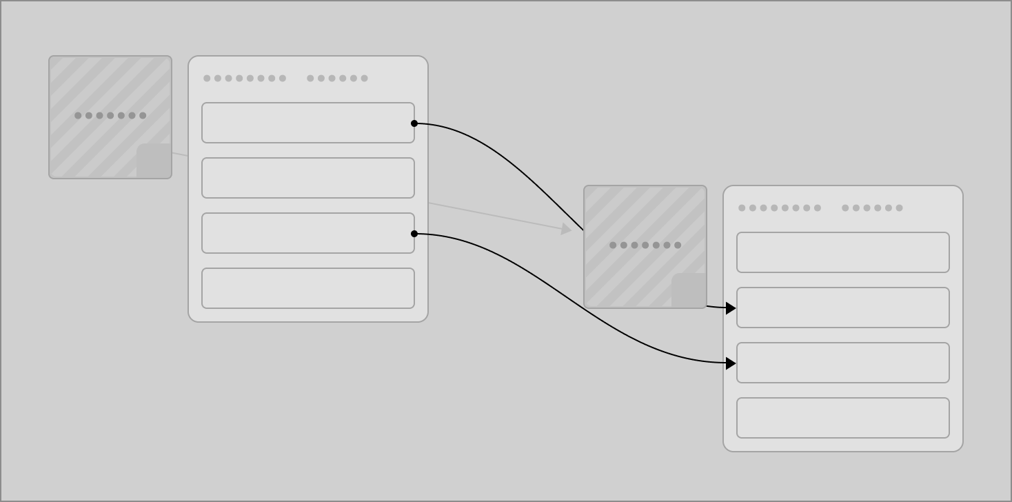
Redesigned service tasks' flow representation
Final touch
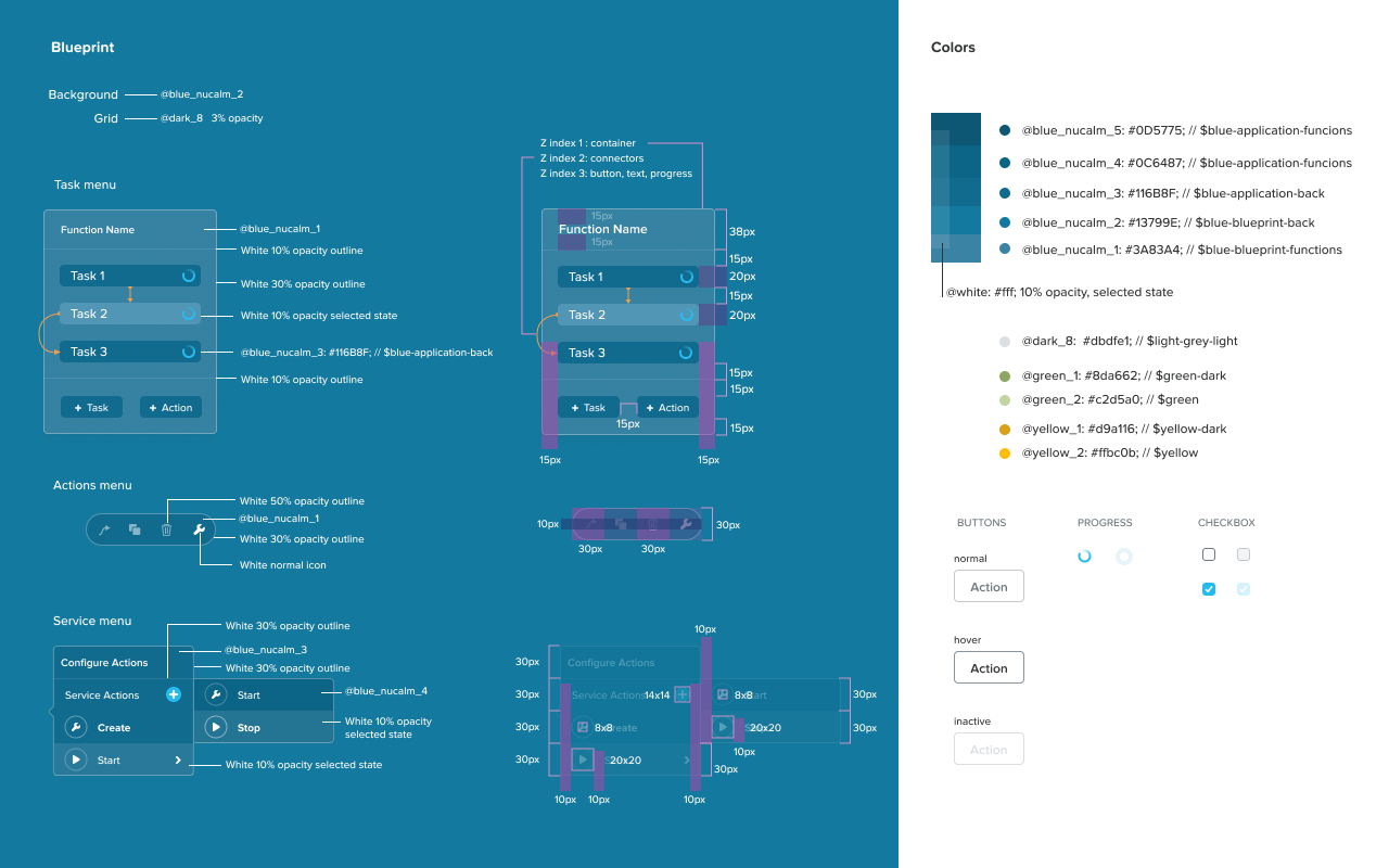
Additional to the contrast created by the straight line and bezier curves, I assigned colours to the arrows:
1. White to the dependency straight line, since white forms the base of the blueprint in combination with the white of the services.
2. Orange to a flow, since it brings focus onto the flow when it is selected, for immediacy.
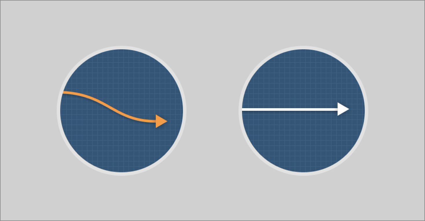
Flow curve and dependency line in respective colours
The final result
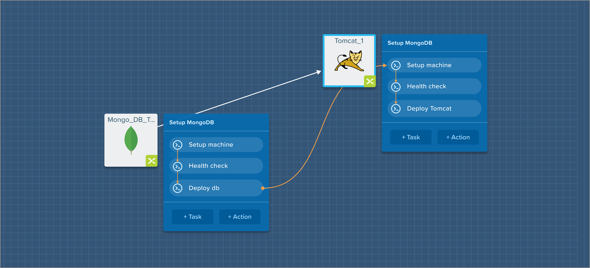
Workflow
Introducing a workflow for blueprint creation
Along with the resolution of the design for the service definition and representations for dependencies and flows, a parallel effort was to make the process of creation of a blueprint more intuitive and aligned with workflows of the DevOps.
Understanding status quo
Setting up and managing the virtual infrastructure is a sophisticated, complicated, delicate and... a muddled process.
Virtual machines are created manually on remote hardware and configured with their operating system. Then, application builds are deployed onto them. Alongside the infra, workflows are identified and configured for all possible scenarios of infrastructure running and maintenance.

A loose illustration of the muddled 'process' of infrastructure setup and management
Problems identified
1. The above process has almost entirely been manual and cumbersome, therefore causing fatigue for the DevOps.
2. Organisations need the flexibility of deploying the same blueprint to different clouds, for various reasons.
3. Managing the infrastructure means wading through multiple applications and interfaces, hence more fatigue.
4. The DevOps doesn't have a single source of truth, either for the blueprint or for the status of the deployed infra
5. In most cases, the DevOps would create blueprints of the infra and monitor it. However, the control of deployment was majorly in the hands of the core tech team, such a lead developer or the CTO, who would '1-click' deploy blueprints for their testing, staging or production purposes. The current workflow didn't make this easy.
Enter solution
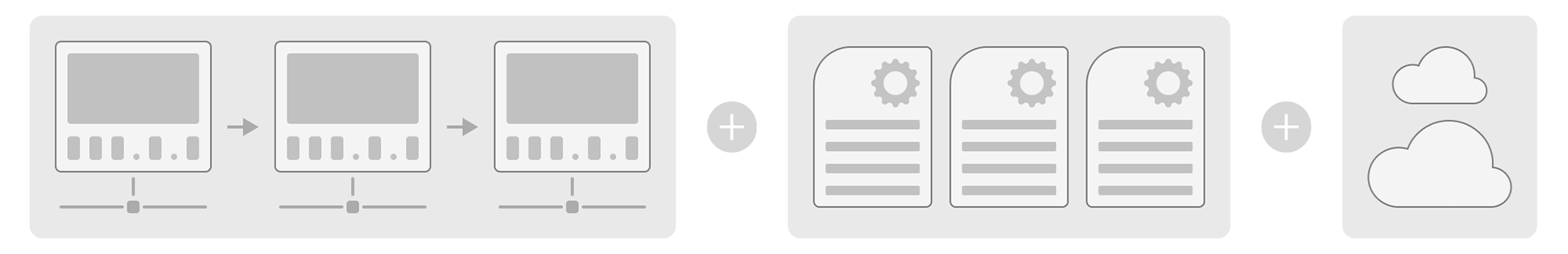
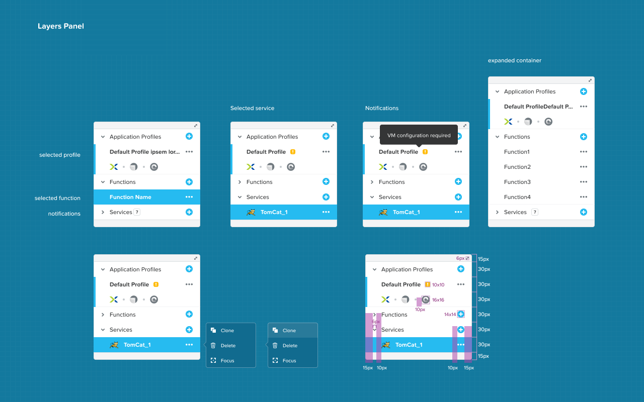
I brainstormed extensively with the product manager and chief architect of CALM to establish that a blueprint can be said to be defined in 3 stages or 'layers':
1st layer • Services and Dependencies between them
2nd layer • Functions (and tasks) that will run on the service
3rd layer • Pre-defined Application Profiles of cloud providers
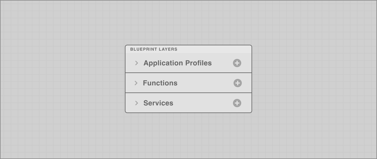
An illustration of the streamlined workflow for blueprint creation that CALM would adopt post the re-design
The interface matched the mental model of the layers in a blueprint, in the order they could be defined:
1. Services
2. Functions
3. Application Profiles
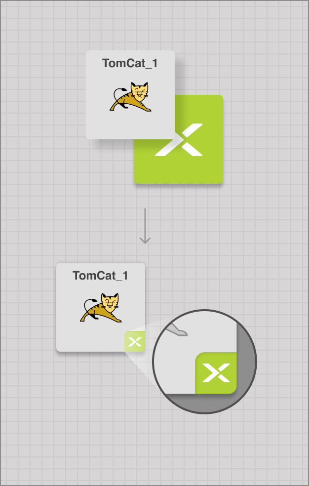
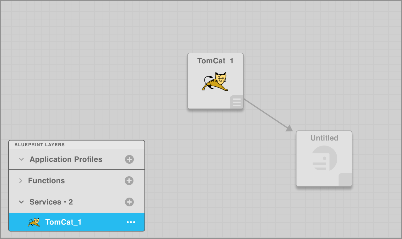
1st layer • Services
A service is the first element to be defined for a blueprint. Defining the service type would also make appear the icon of the service type.
An empty service has a generic service icon too.
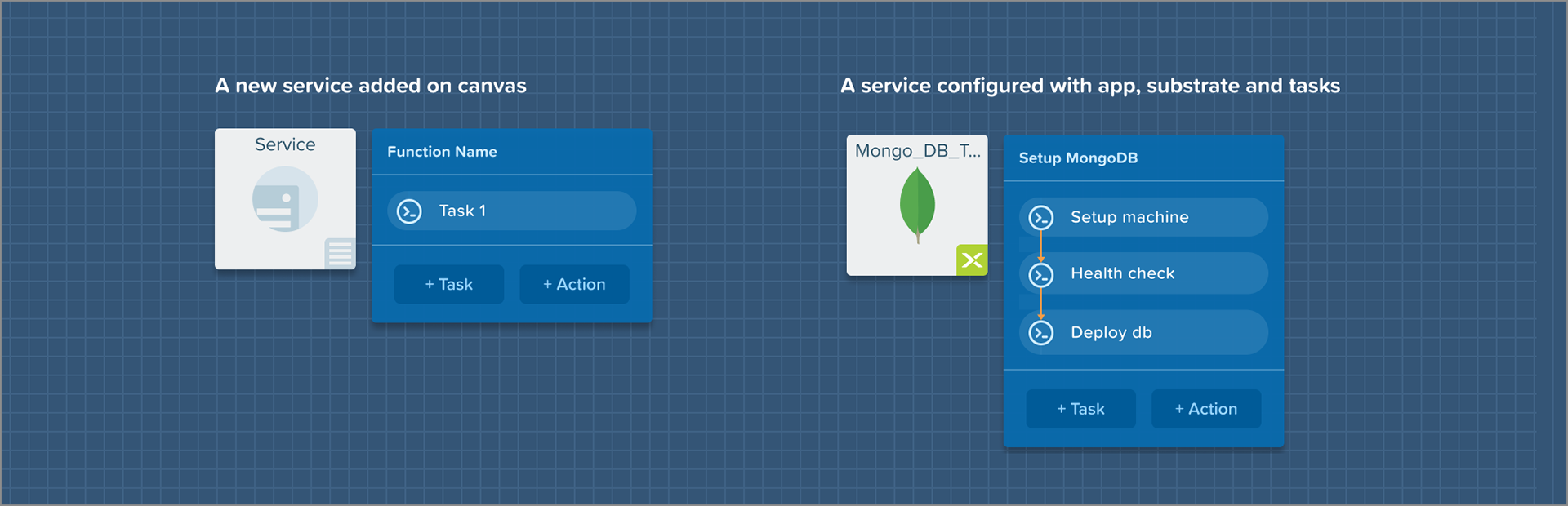
2nd layer • Functions
Creating a function creates an empty task list to be populated with tasks, which can then be connected across services.
3rd layer • Application Profiles
The same services' architecture could be deployed across multiple clouds and in different possible deployment configurations. Application profiles give DevOps the flexibility to keep this options open while running the blueprint.
Testing the new design
Preparing the prototype
The foundation of this big redesign were [1] the new workflow and the [2] representations. Once we had internal agreement on these pieces, I created a clickable prototype of the workflow of:
1. Setting up a simple blueprint
2. Deploying it to my cloud
3. Monitoring it
I recruited 4 users to test this prototype. I had the following questions in mind:
1. Does the workflow make sense to the user?
2. Is the representation of the service intuitive?
3. Are the representations of the relationships intuitive?
3. What does the user think about the aesthetics?
Results
1. The workflow made immediate seamless sense for all the 4 users
2. The representation for the service made perfect sense, especially in light of the new and clear workflow
3. The representations used for relationships made immediate perfect sense to users
4. Below are some reactions to the redesigned CALM:
'Wow, this is really neat!'
'Never seen enterprise software this great looking!'
'This just makes sense!'
When it all came together
A simple and delightful interface to create cloud blueprints
The blueprint designed is a fairly vivid presentation but successfully brings together all elements and the layers of information for the users to be able to define blueprints with ease.
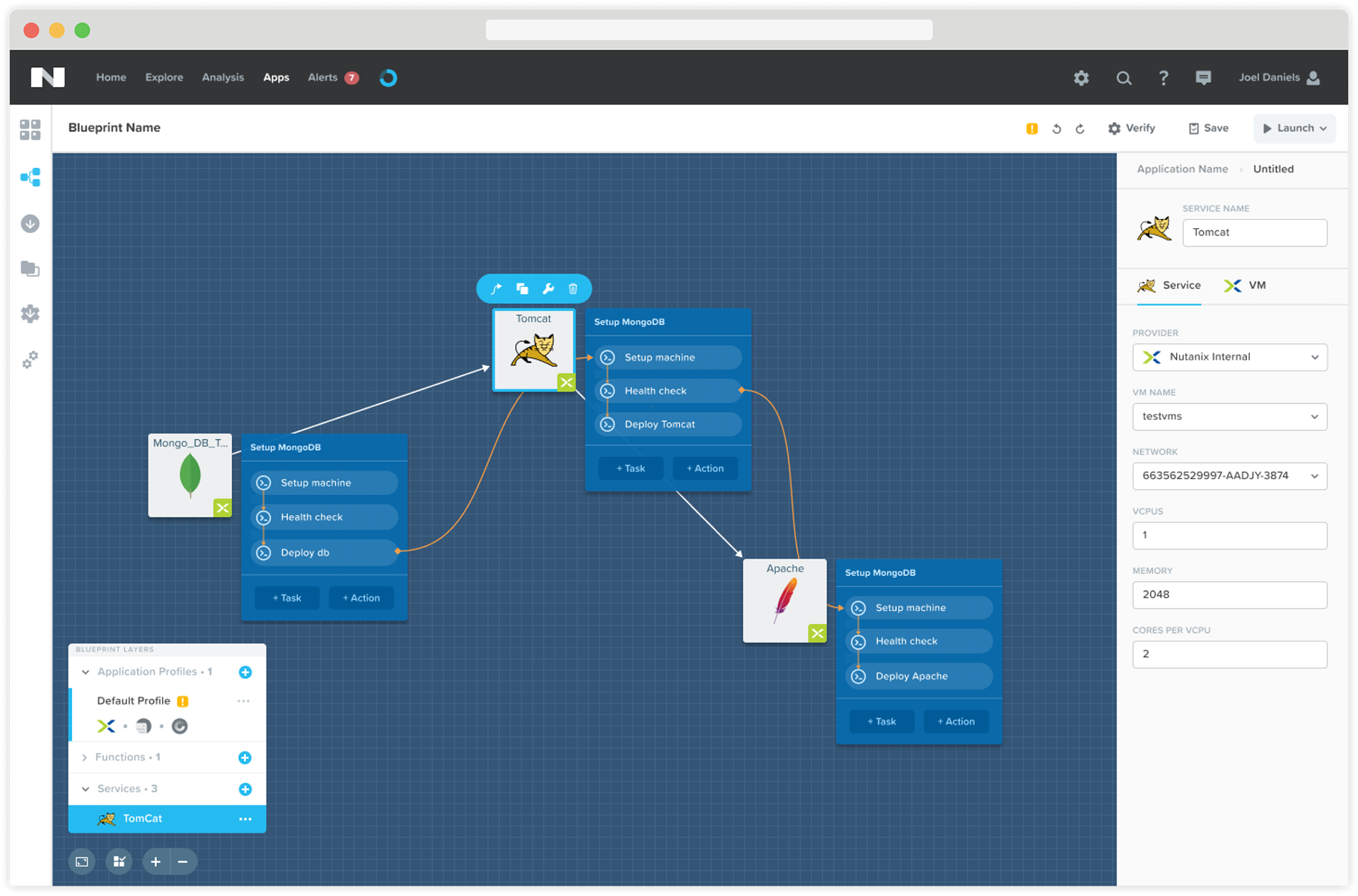
The blueprint canvas interface showing services added with dependencies and configuration of the selected service. On the bottom left is the layers panel which shows the Services, Functions and Application profiles.
A glass-pane to view the cloud's life through
With the sky as the metaphor, the Deployment Console shows the virtual machines to be 'breathing' alive or struggling (if there would be an issue that might need attention). The console also contains all the operations defined in the designer. If an operation is currently running, the progress of the tasks can be seen in the inspector window.

A snapshot of the application console which shows the progress of a running app
Apart from the view which displayed virtual machines in a grid arrangement, the infra could also be viewed in its topological definition, right as it has been defined in the blueprint. The advantage of this view is that the operation defined can be seen more clearly, in context of the machine(s) on which it is currently running, along with the progress indication.

The topology of the function showing the Create function in progress
Design system
UI Framework
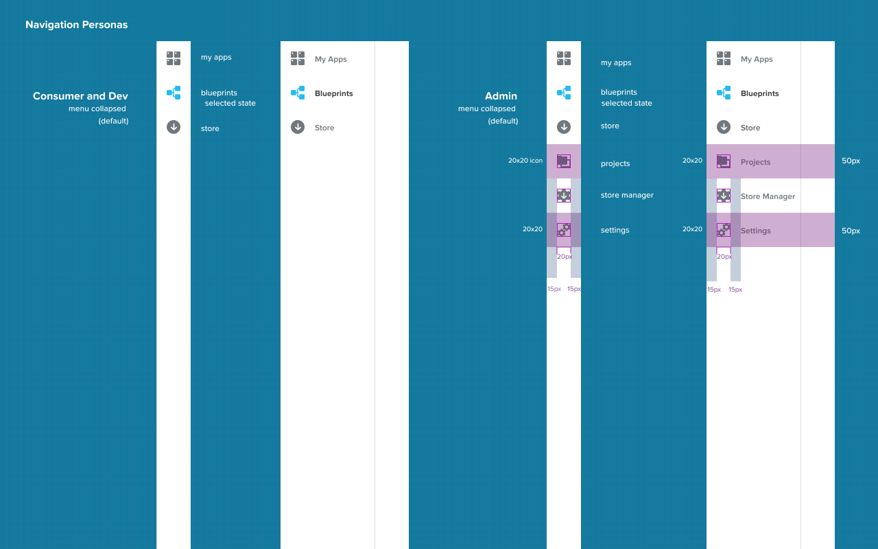
The UI followed a standard navigation and item selection method:
1. Top-to-bottom
2. Left-to-right
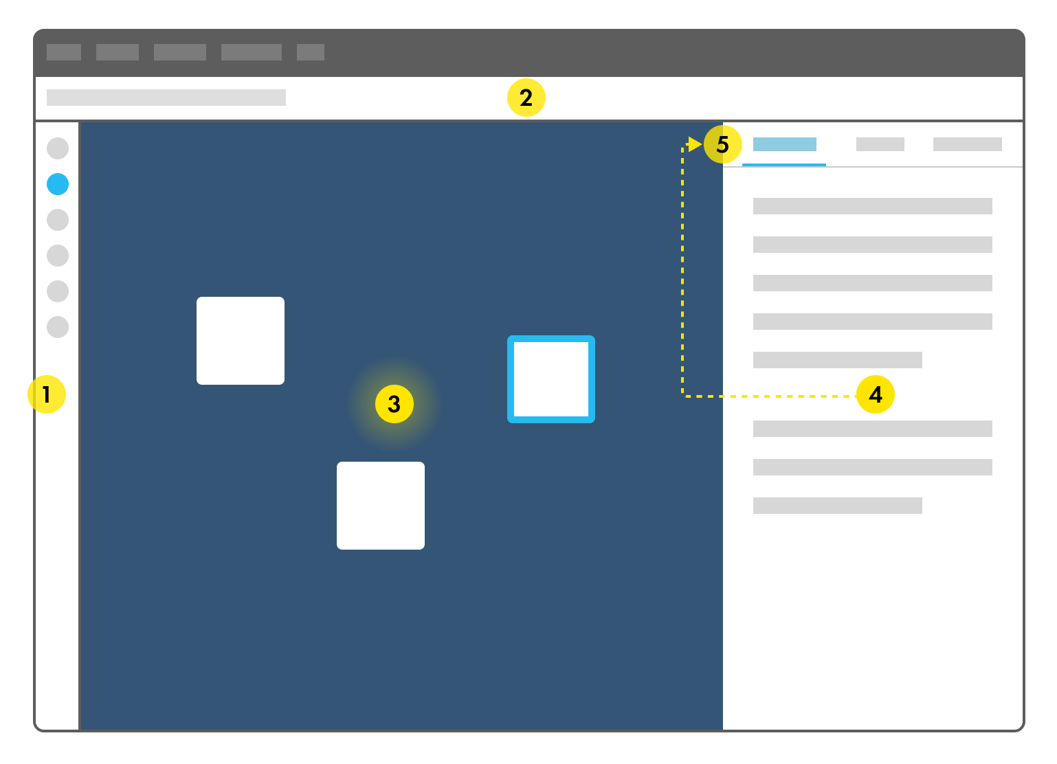
An interface framework was also defined to keep clarity of communication over the nomenclature with the developers and managers of the project. Shown below are some aspects of this framework.
The UI was broadly divided into the following areas:
1. Primary Navigation
2. Header
3. Context
4. Inspector Pane
5. Tab Navigation for inspector pane
The CALM primary blue was the selection colour that intended to make clear the selection.
Design system
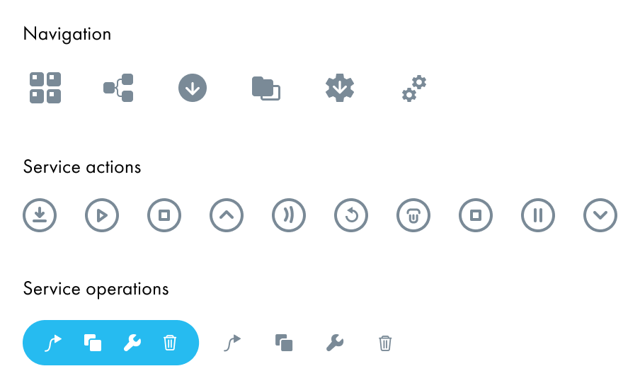
Iconography
I also designed a range of icons for different uses considering especially the small sizes in which they had to appear across the UI
Design system
Components
In partnership with the visual designer on team CALM, I created a comprehensive and detailed style and pattern reference to communicate the elements of construction of the CALM interface to the development team.
Design system
Accessibility
I was super lucky to have pro-active participation from the developers on the team in making CALM's UI accessible. Using commonly available tools we paid careful attention to:
1. Minimum contrast between backgrounds and text over them was 4.5
2. Minimum contrast between visual layers in the interface was 3.0
3. There were keyboard shortcuts for most operations such as dismissing contextual menus
4. Tooltips were added to all icons or CTAs which were icon-only
Results & Validation
After the redesigned CALM was launched to customers, the following was observed:
1. The new representations for the service, blueprint, blueprint designer and deployment console were very clear to most DevOps and they adopted it with ease
2. The cognitive load of 'figuring out' the contexts as well as representations significantly reduced
3. Training time came down from 3 hour workshops to 15 minute demos
4. CALM acquired 10+ new customers within the first 2 weeks of the public launch of the new interface. This was a significant rise from the average of 5 customers per month acquired before this.
4. Returning questions from customers came down from 3 questions/calls daily to a maximum of 1-2 per week.
What my collaborators have to say

Aditya is a top-notch designer and UX thinker. He has a keen eye for detail, a superb imaginative sense, and a superlative sense of aesthetics. I have worked with him for over 3 years and he contributed immensely to the success of Calm.io. Aditya defined the beautiful look, experience and metaphors for Calm. Any product would be lucky to have him.
I met Aditya at a friend's office in Dharamshala, of all the places. We immediately hit it off, connecting about design and UX. Aditya started working on Calm.io design as a consultant — encompassing not only the UI, but including typography, visual themes, the UX.
The next one year was spent in slowly enticing Aditya to come work full-time at Calm, and finally he succumbed to the allure of working with the Calm folks. The next 3 years were spent working intensively on making Calm the best looking & most usable DevOps platform. The results speak for themselves.
Highly recommended!
Aaditya Sood, Co-founder, CALM.io

"Aditya’s unique design approach got us to the core of the problem in the visualisation of cloud application architecture. At the end of a rigorous process of research, brainstorming and prototyping, he came up with a sophisticated design system for calm that was delightful and made perfect sense. Overall, it has been a sheer pleasure to work with him and I look forward to work with him on newer projects in the future."
Balaji Janakiram, Chief Architect, CALM.io

"Aditya has a knack for simplifying complex technical concepts to relatable objects and then translating that understanding to a high fidelity prototype. We worked together on the interfaces and UX journeys of DevOps automation tool Calm.io (Acquired by Nutanix). Aditya delivered a new vision for the design system for the cloud backed by his first-hand research. The product was a success with users owing to its aesthetics and that it was intuitive and enjoyable."
Ashutosh Kumar, Product Manager, CALM.io

Aditya joined Calm.io initially as a beginner on the infrastructure/cloud/devops side of things, but he dived into the deep end of the pool, engaging deeply both internally with the ops and PM team and external research on the industry to form a clear picture of user needs. He drove the redesign of calm.io with a keen sense of curiosity, inquiry and creativity, building intuitive UX in the process. His sense of UX, both the extremely high quality and speed of execution left everyone impressed. Highly recommend him as a designer who is not afraid of continuously asking tough questions to get to whats right for the end user of any product.
Jasnoor Gill, Senior Director PM at Nutanix