
Making bill payments exciting for India
Bills are boring. We post-pone them till the last minute. Payments Desk by Billdesk would change that.
To achieve the goal of forming a renewed relationship with millions of existing Indians, we employed the broad visual strategy of combining emotive, bold and abstract illustrations with bold typography.
Personification of payments

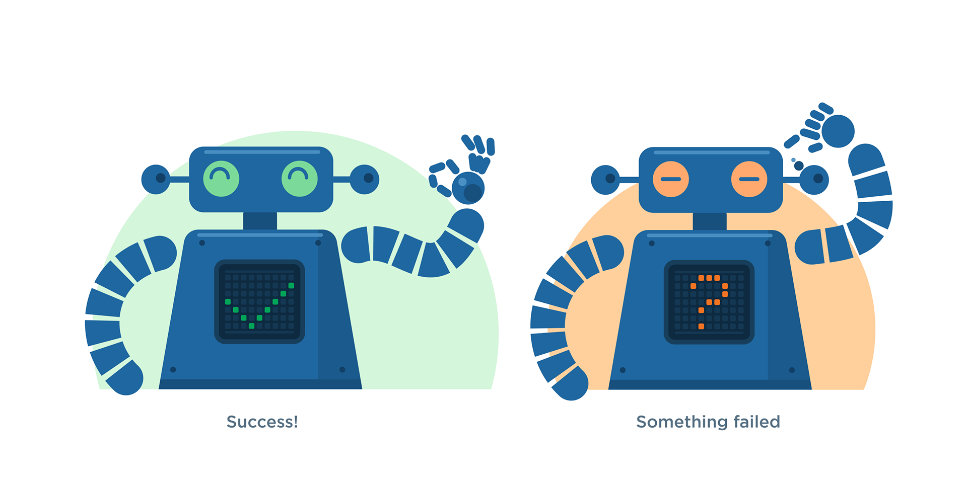
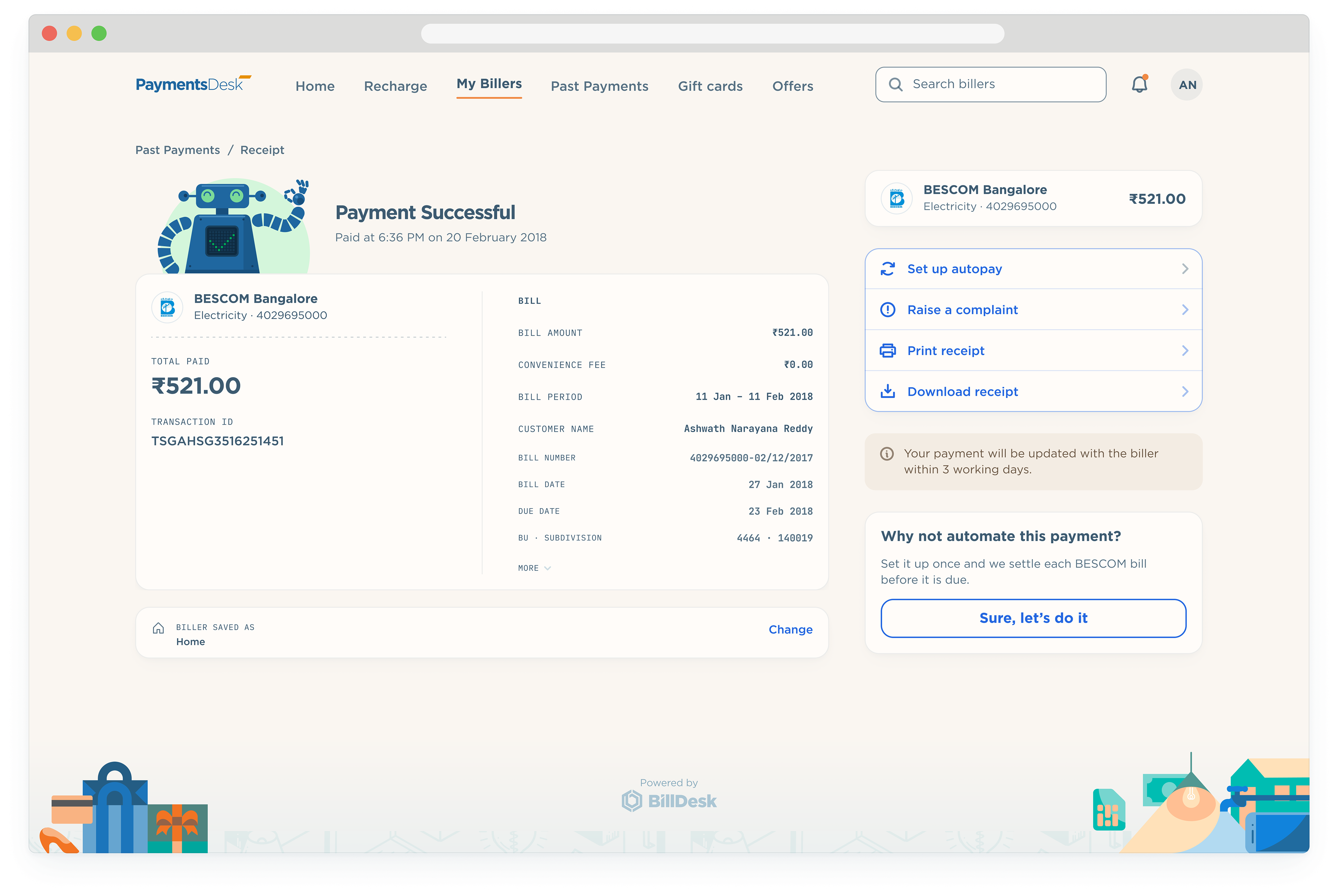
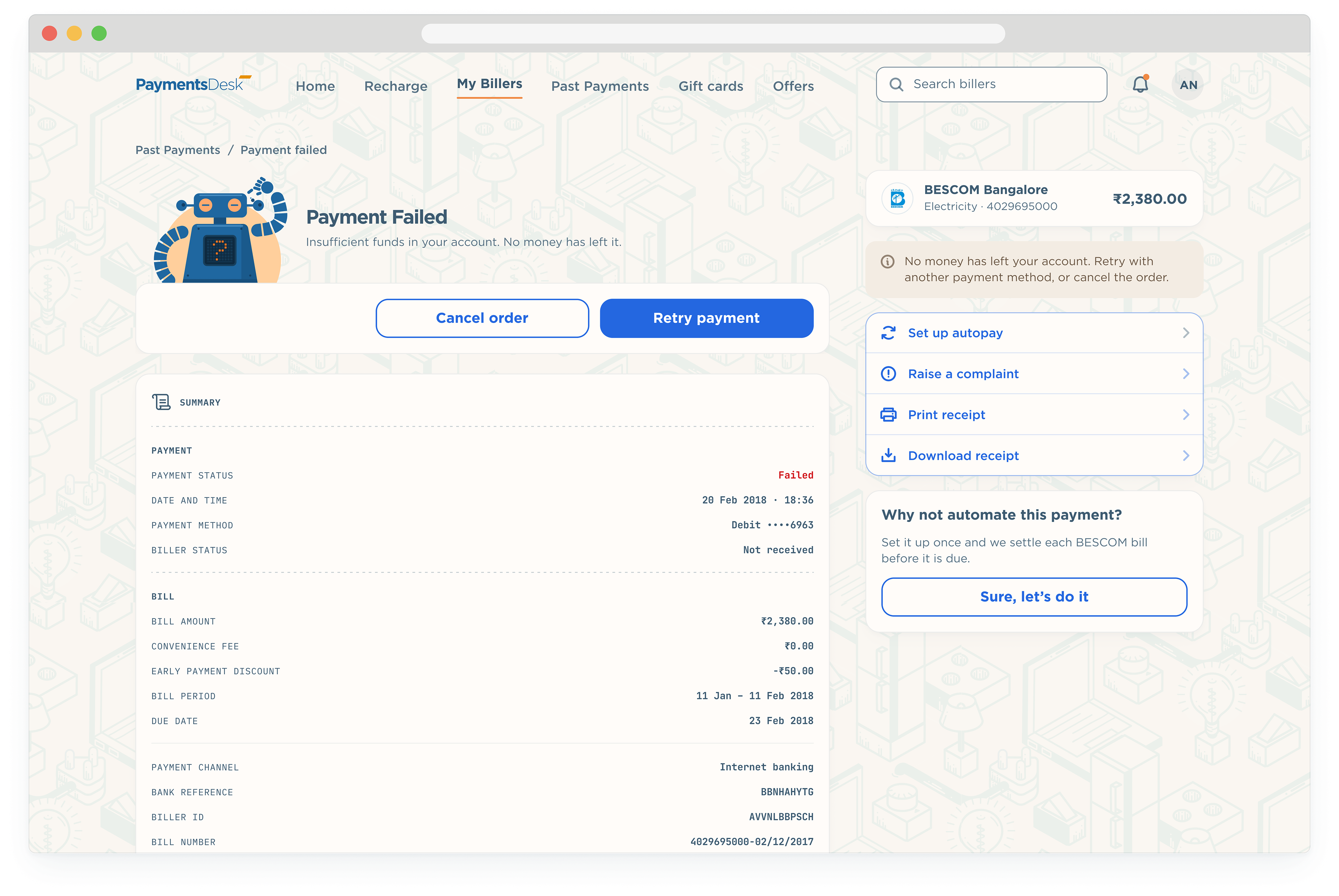
Robill is BillDesk’s mascot, a small blue robot with a screen for a chest. In the redesign he became the app’s way of reporting outcomes: the display shows a tick when a payment goes through, a cross when it fails, a heart on the home page, and a question mark when he does not know yet.
His poses are built from a small kit of parts, so a new state takes an afternoon rather than a new illustration.

14 types of payments
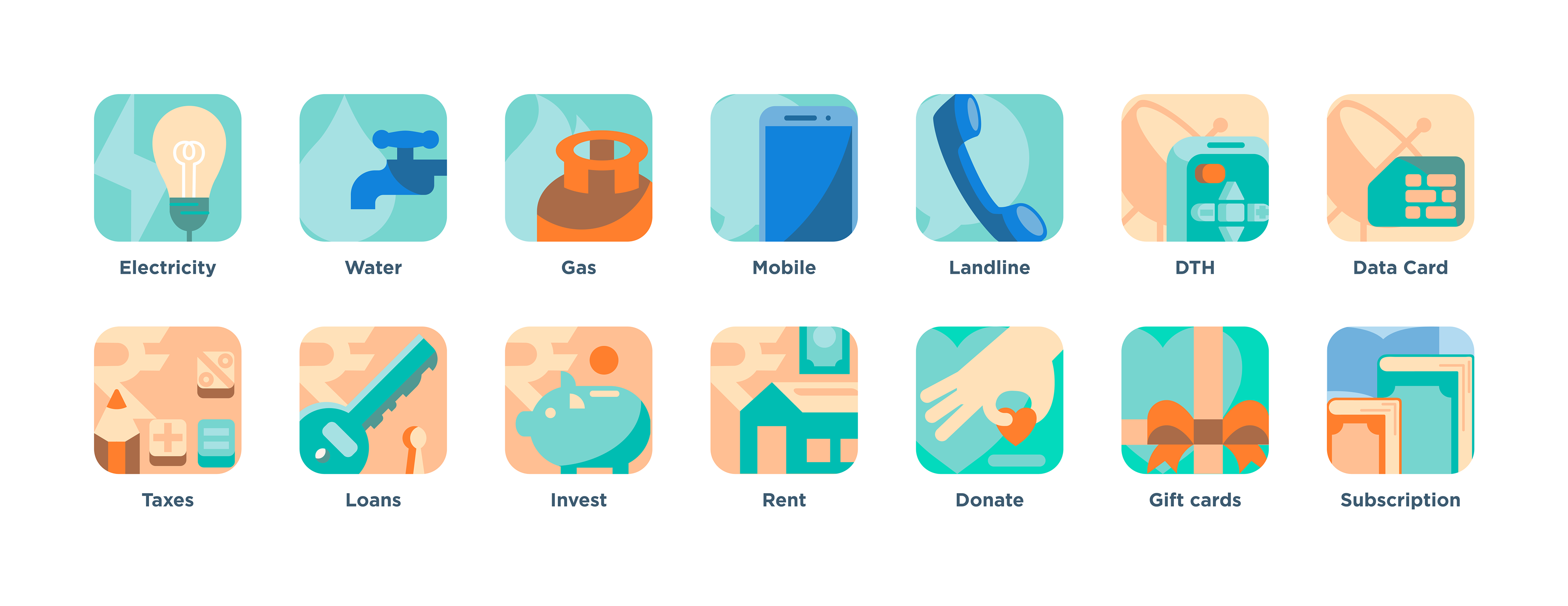
The categories keep the illustrations drawn for the 2018 product, each cropped tight inside a rounded tile so the subject fills it. They were lifted a little in saturation and lightness to sit on the warm paper, and every tile carries the same white outline and the same gap to its label, on mobile and on desktop.
Making the dinosaurs extinct
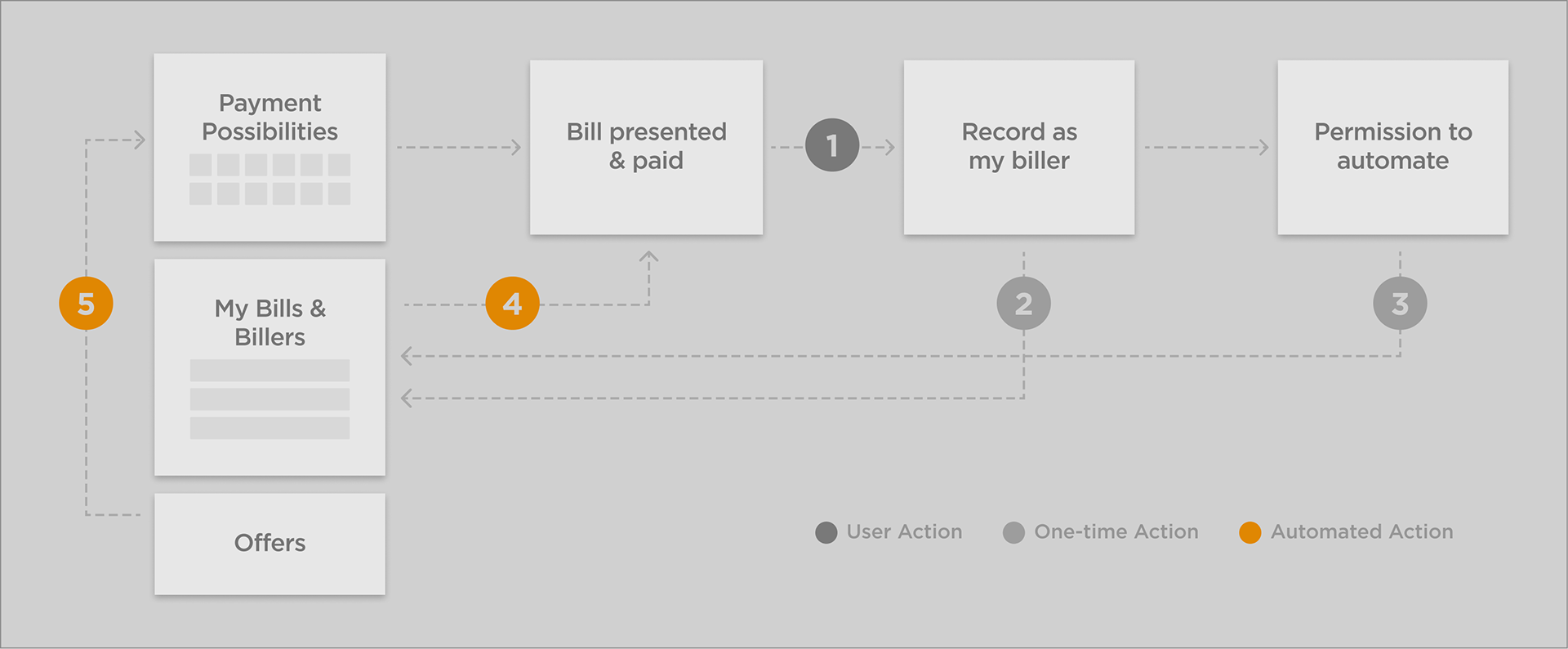
The idea behind payments desk was to remove the friction in making bill payments. So, most actions needed either needed only a one-time input from the user, once automated.
A Unique & Special Interface
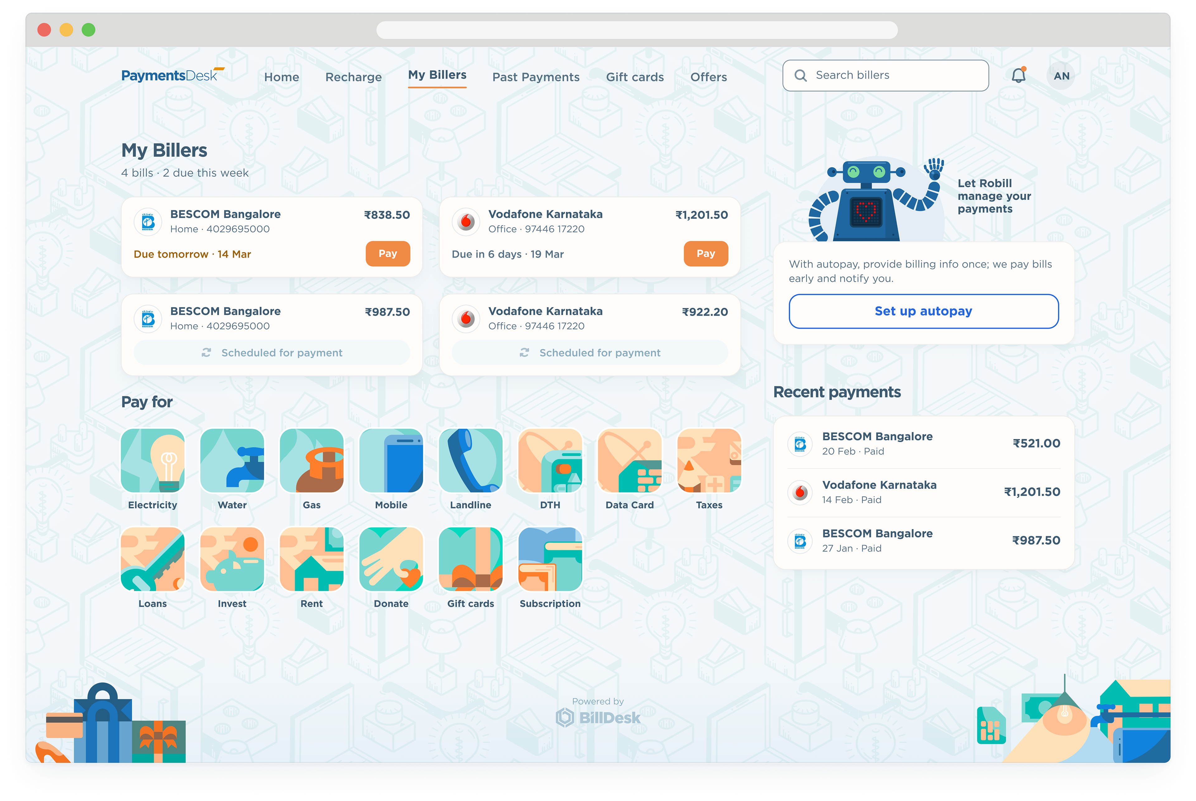
The home screen is the bill stack. Bills that need paying sit on top, with a due date that changes colour as the date nears, scheduled bills follow in a quieter tone, and the categories for adding a biller come next. Robill, the BillDesk mascot, closes the page with a nudge towards autopay.
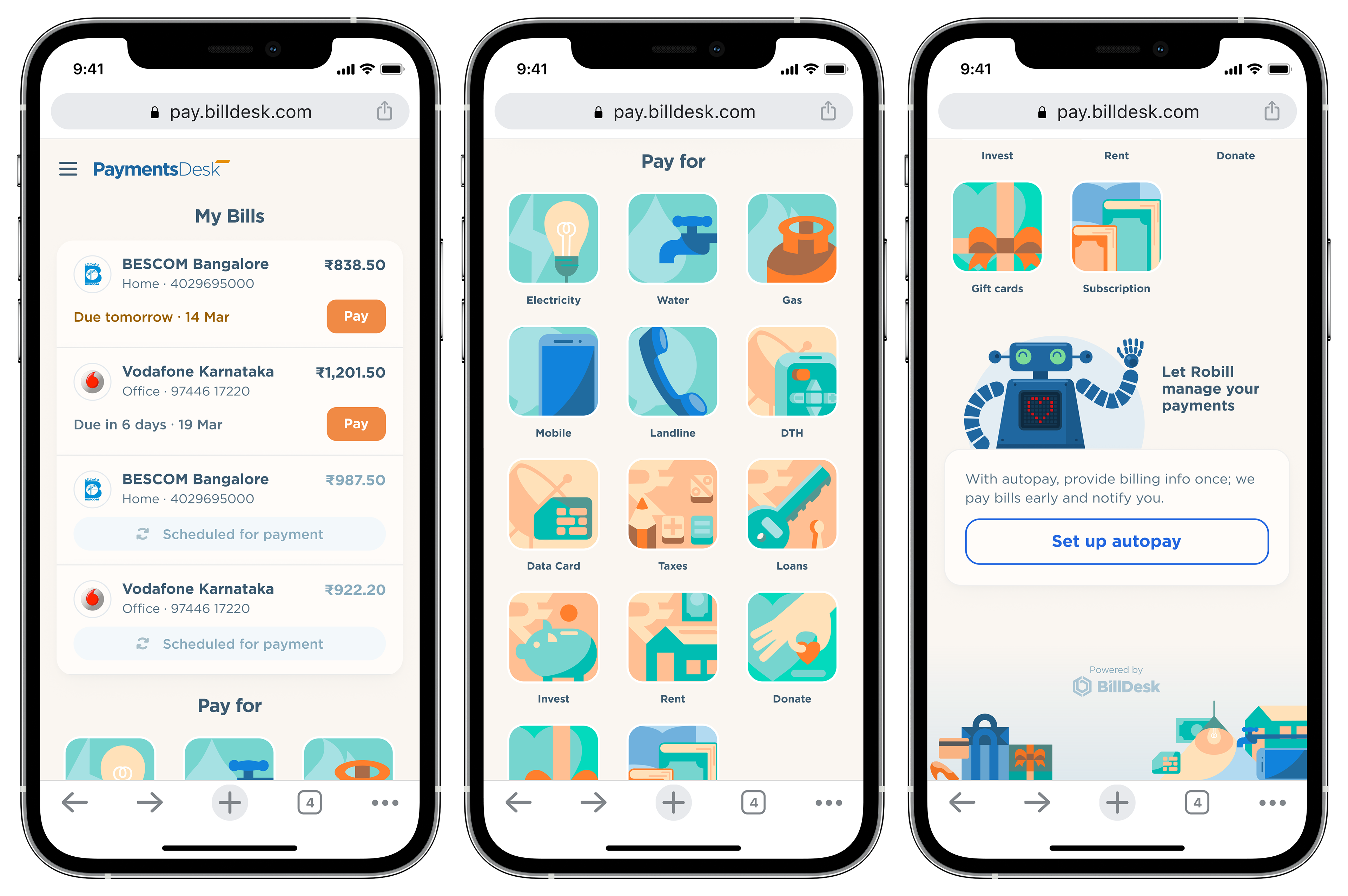
Home on mobile: due bills, the categories, and the autopay prompt.
On desktop the home page spreads out: the bill stack two up, the categories seven across, and a right rail with autopay and recent payments. The page pattern, drawn from the BillDesk identity, sits behind everything at seven percent.
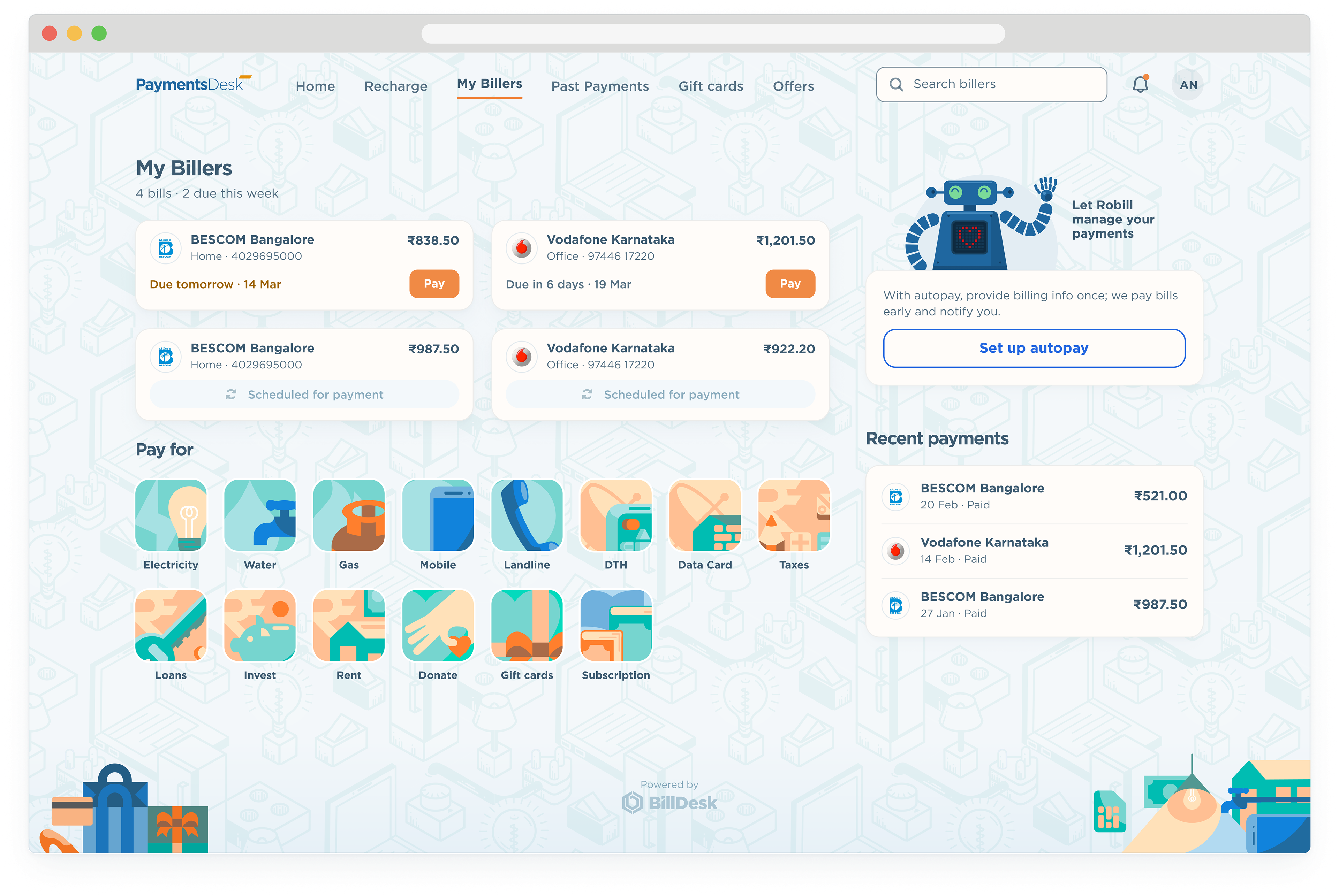
Home on desktop: bills, categories and the rail.
Adding a biller takes two short steps. The user picks the biller from the list under a category, then types the account number from the paper bill; a note says where to find it and how long the first bill takes to arrive.
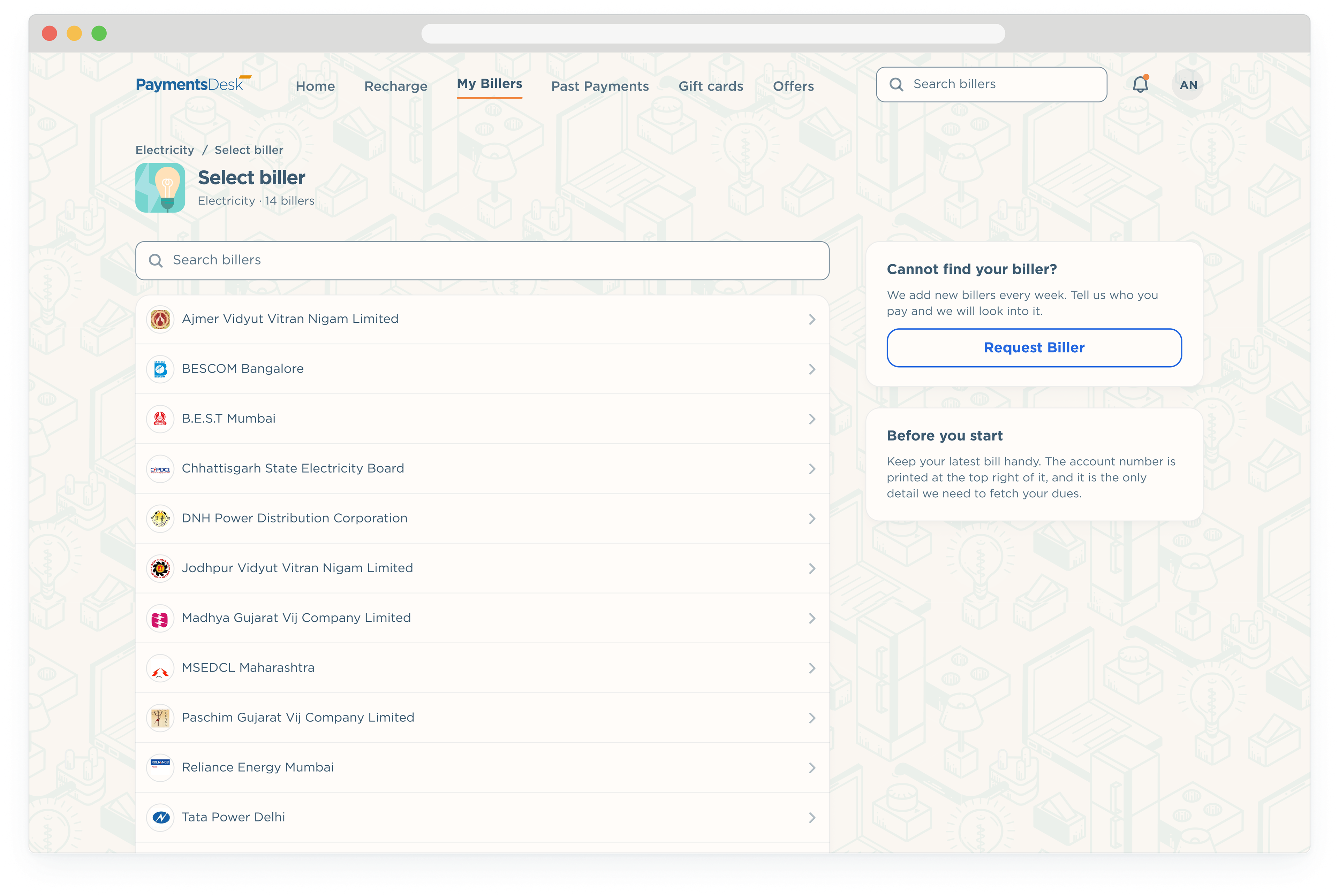
Adding a biller takes two short steps. The user picks the biller from the list under a category, then types the account number from the paper bill; a note says where to find it and how long the first bill takes to arrive.
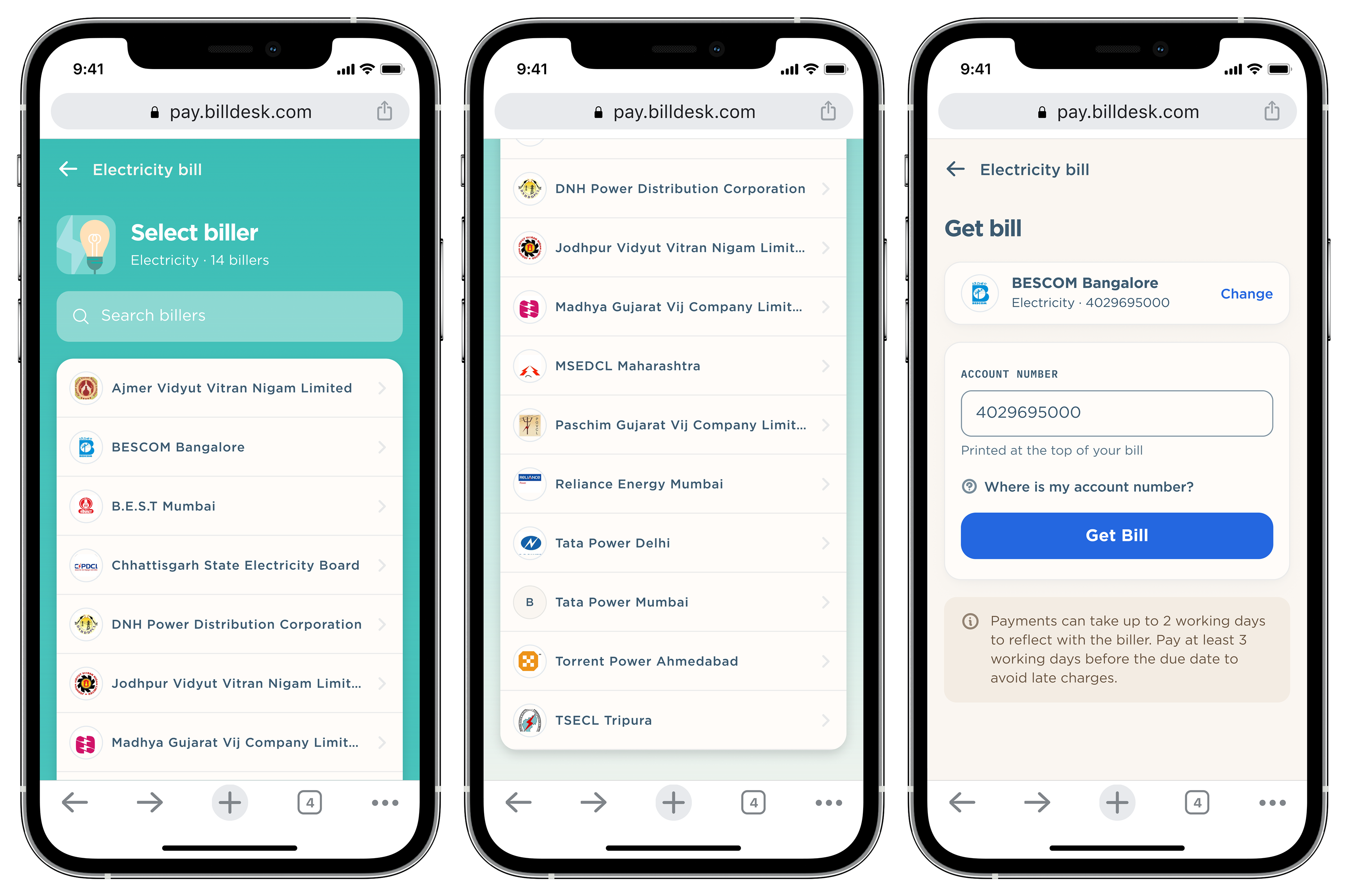
The biller list and the account number form keep the mobile structure in a 780 column, with the rail carrying the help text and the next step.
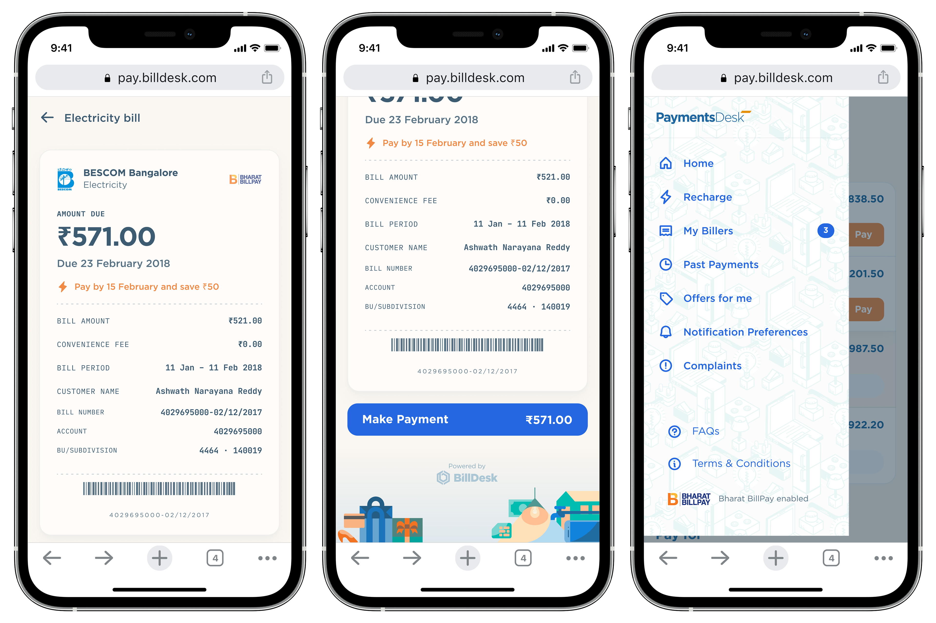
View and pay, and the main menu
I drew the bill as a bill: the amount due, the due date, an early payment prompt, the line items and a barcode stub on one card, with the pay button carrying the amount. The menu slides in from the left in the same quiet ink.
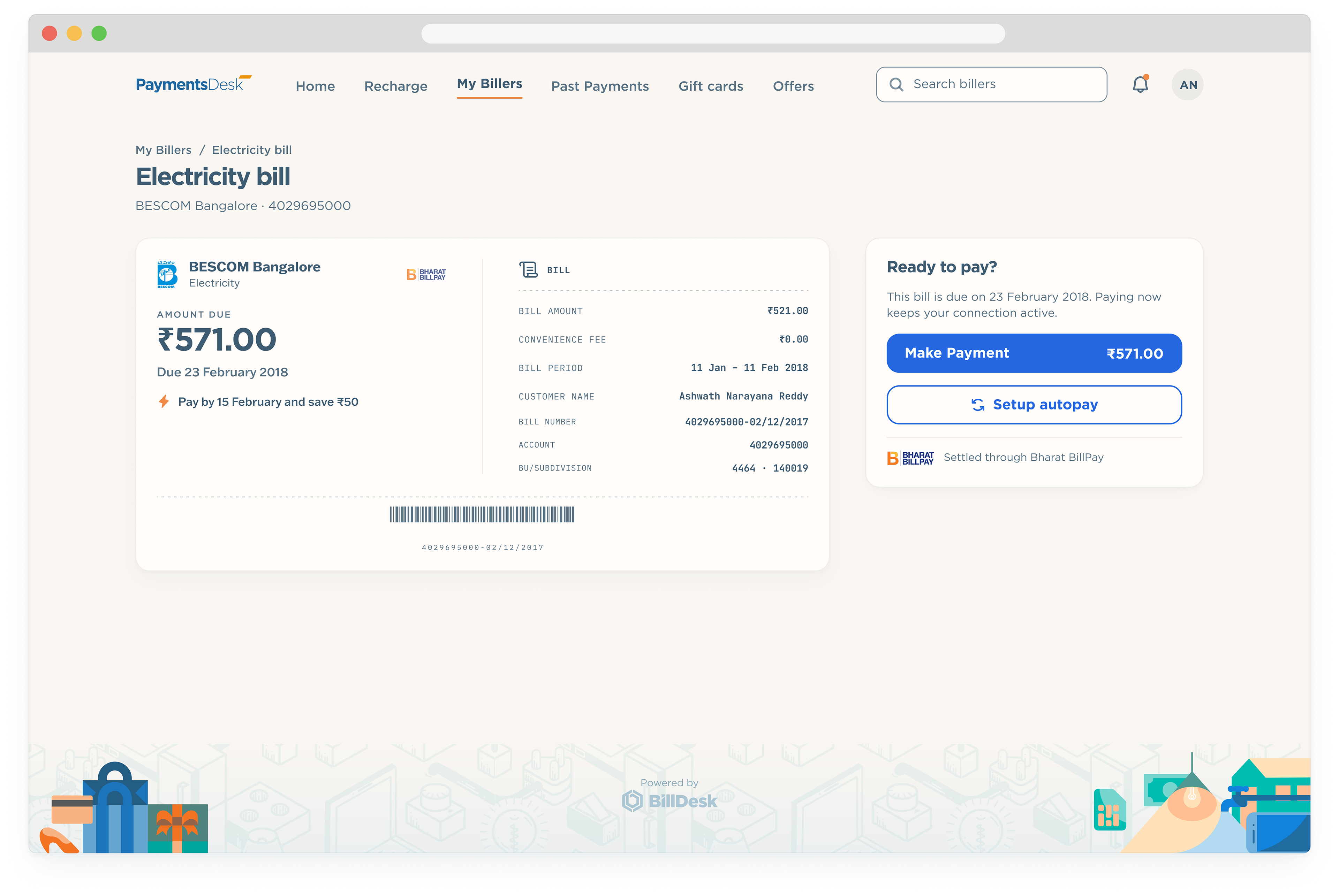
The bill card runs two columns on desktop, the amount and the prompt on the left and the line items on the right, with the pay panel in the rail. The account menu drops down over the landing page.
Success and failure share one shape: Robill at the top with his display, the details card in two columns, and the follow-up actions in the rail. The failed state keeps the reason and the retry in the first screen.
Gift your loved ones
Sending a gift card starts with the occasion, and a five-step stepper keeps the user placed through the flow. The card itself is designed in the app, beginning with a theme picked from the gallery.
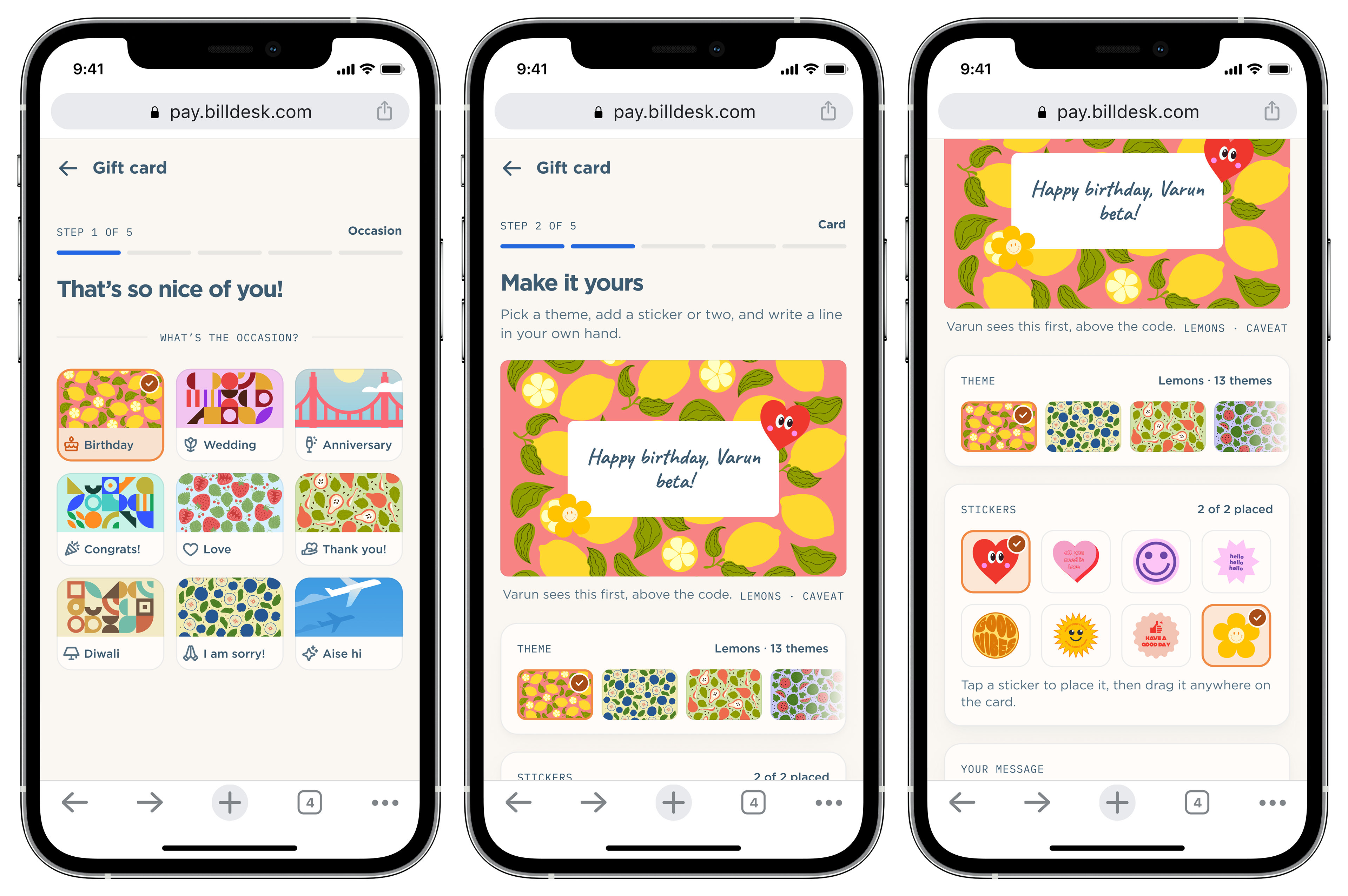
Sending a gift card starts with the occasion, and a five-step stepper keeps the user placed through the flow. The card itself is designed in the app, beginning with a theme picked from the gallery.
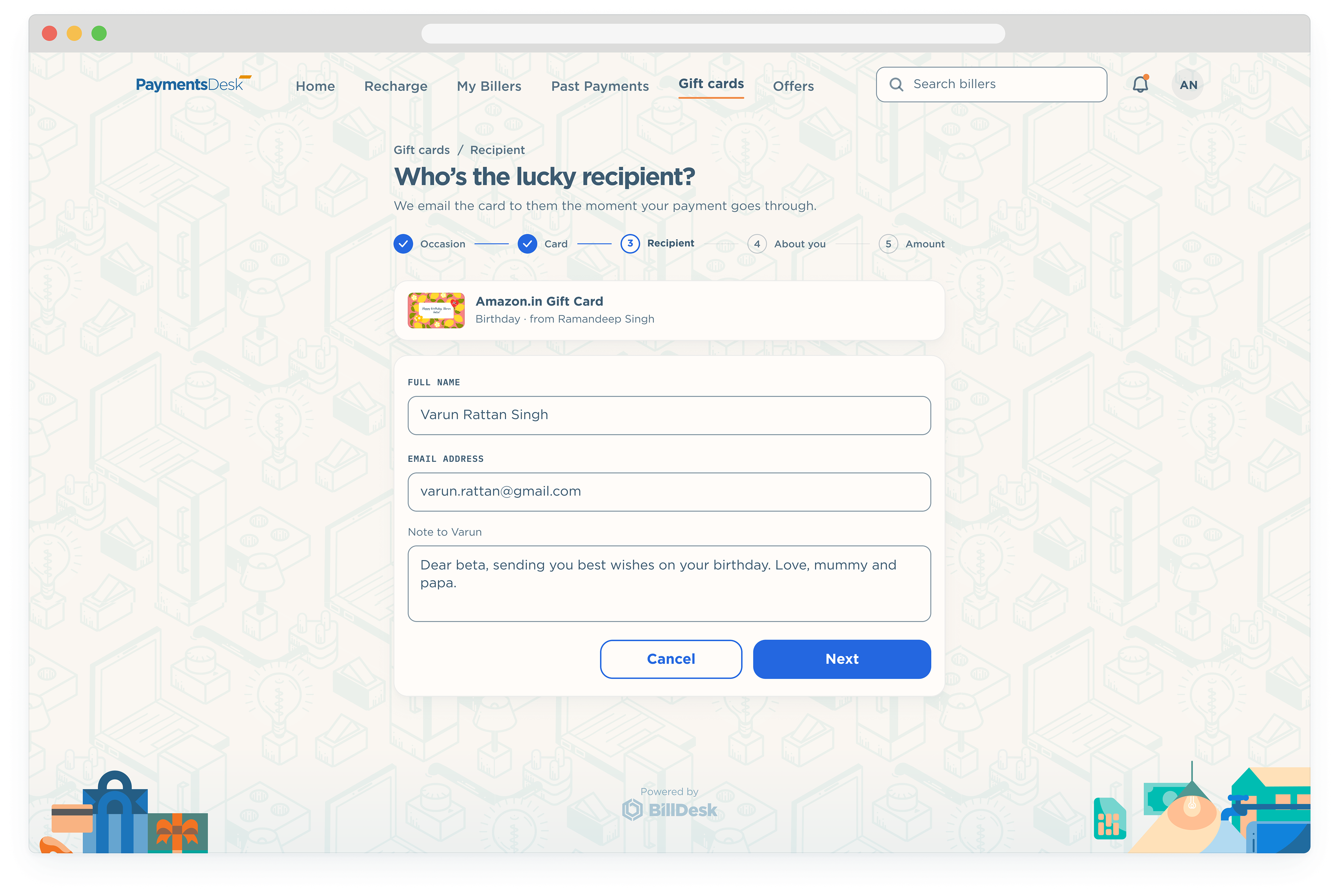
The message is capped at thirty characters and the field says so the moment the limit is crossed. The recipient step follows, empty and then filled, with the card preview keeping up.
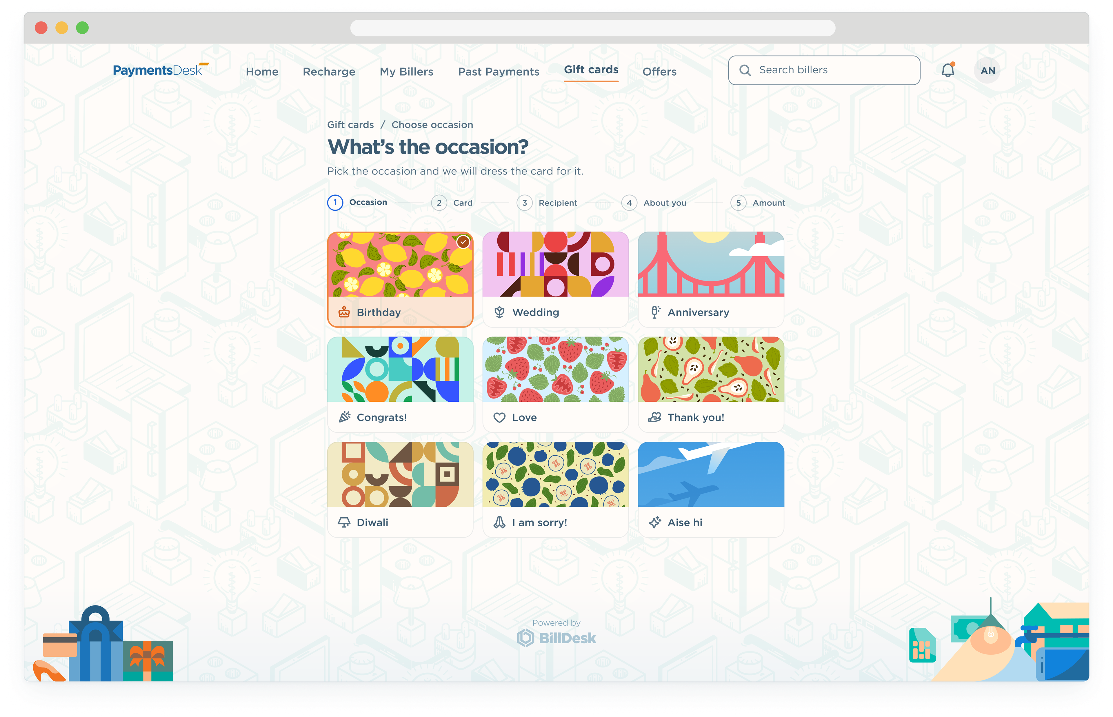
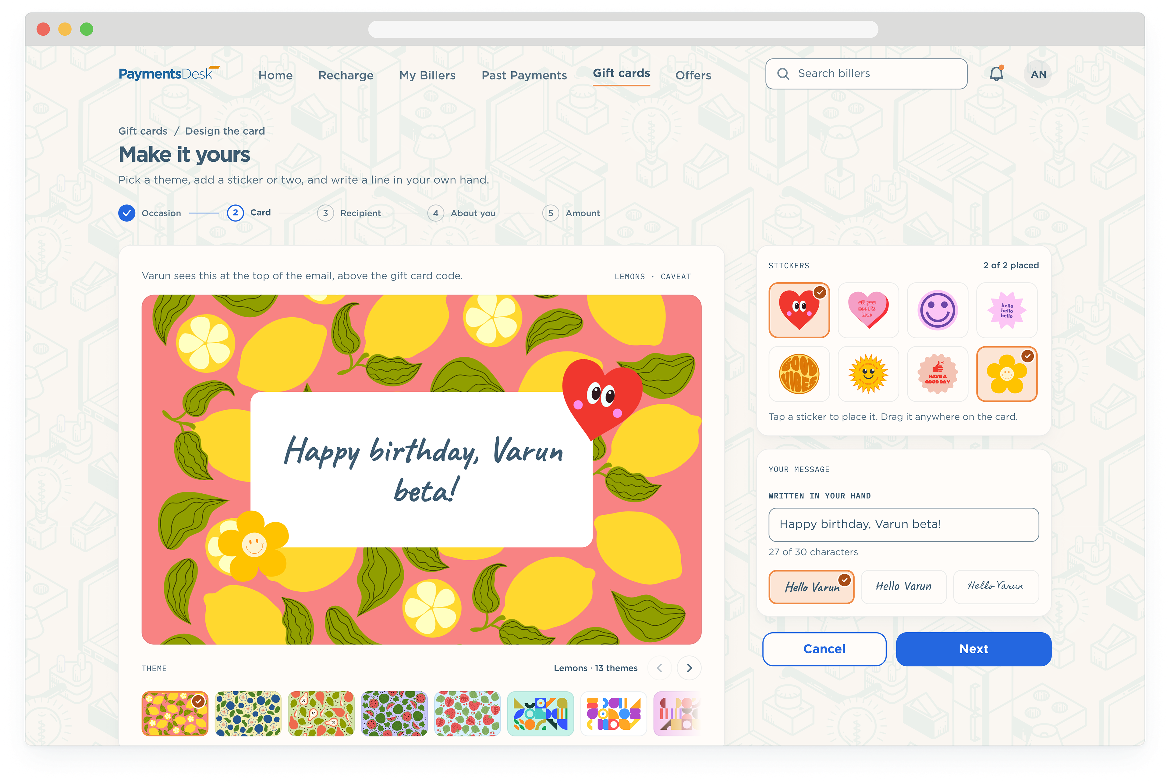
The gift card flow on desktop uses the same five-step stepper and a wider card designer. Themes run in a strip that scrolls sideways, stickers sit on their own layer, and the message is written in the sender’s hand.
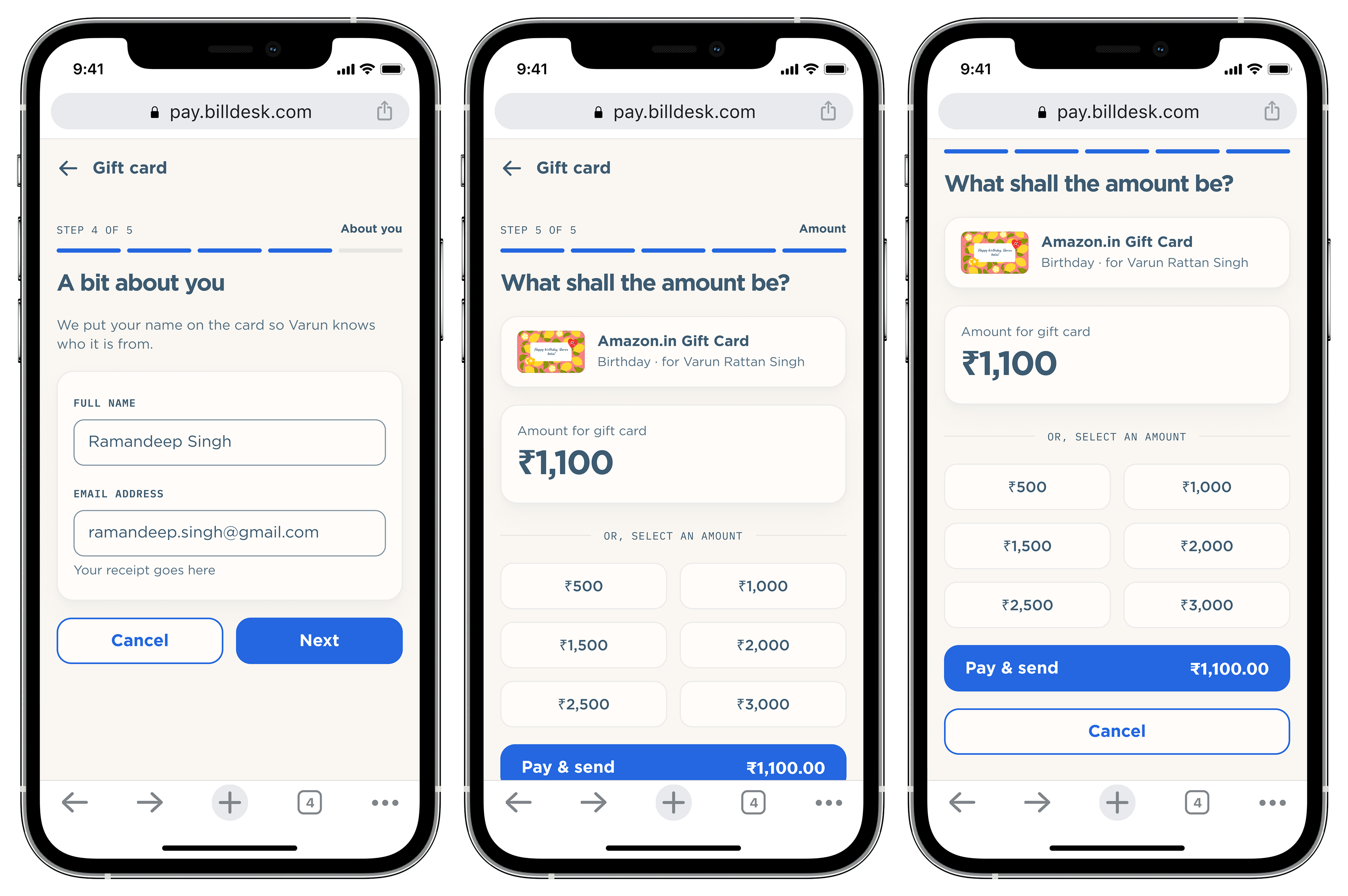
Sender details, then the amount.
The sender adds a name and an email for the receipt, then picks an amount from the presets or types one. The pay button carries the total so there is no surprise at the end.
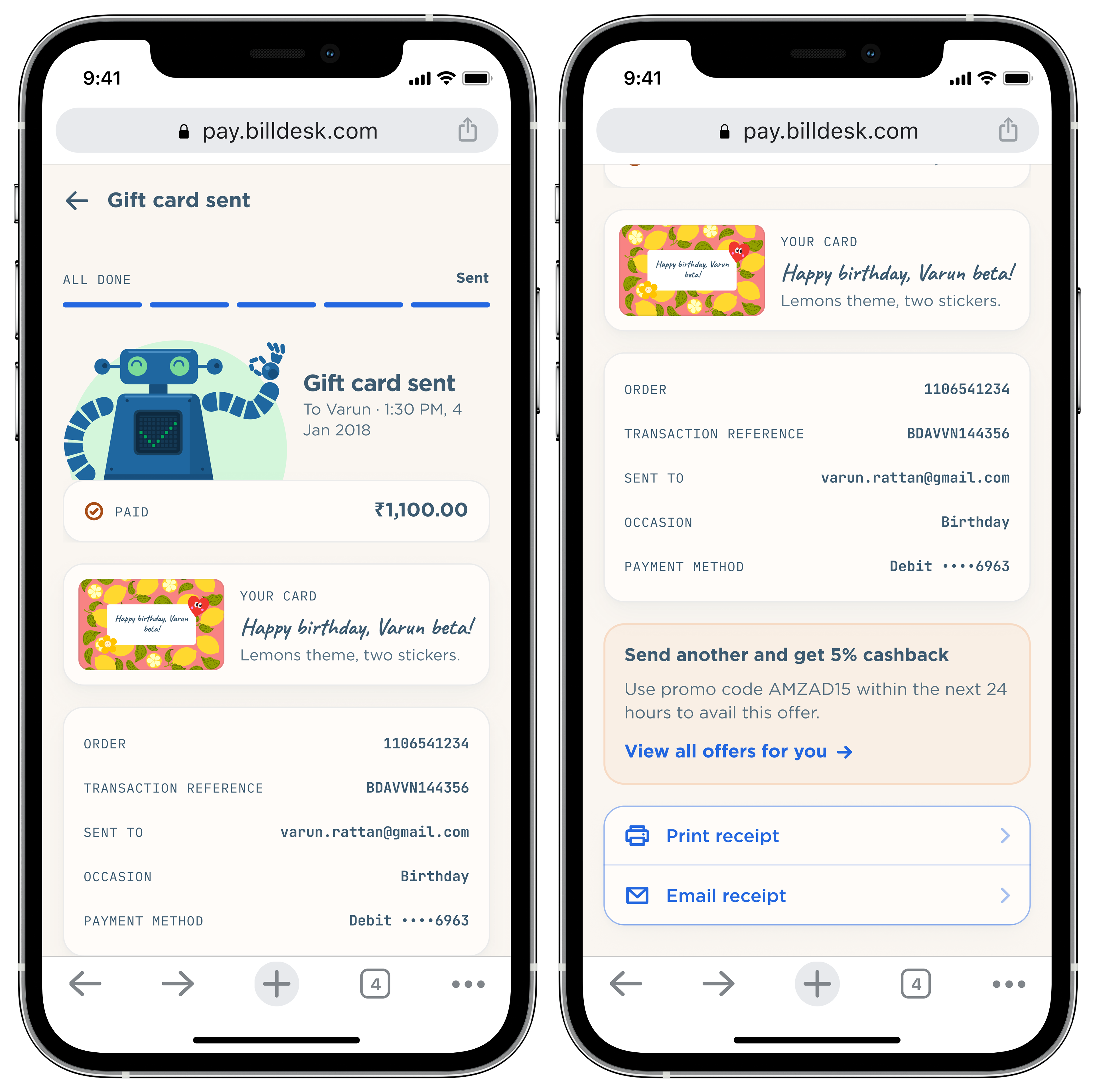
The confirmation shows Robill’s tick, the card as it will arrive, and the transaction details for the record.
Making donations
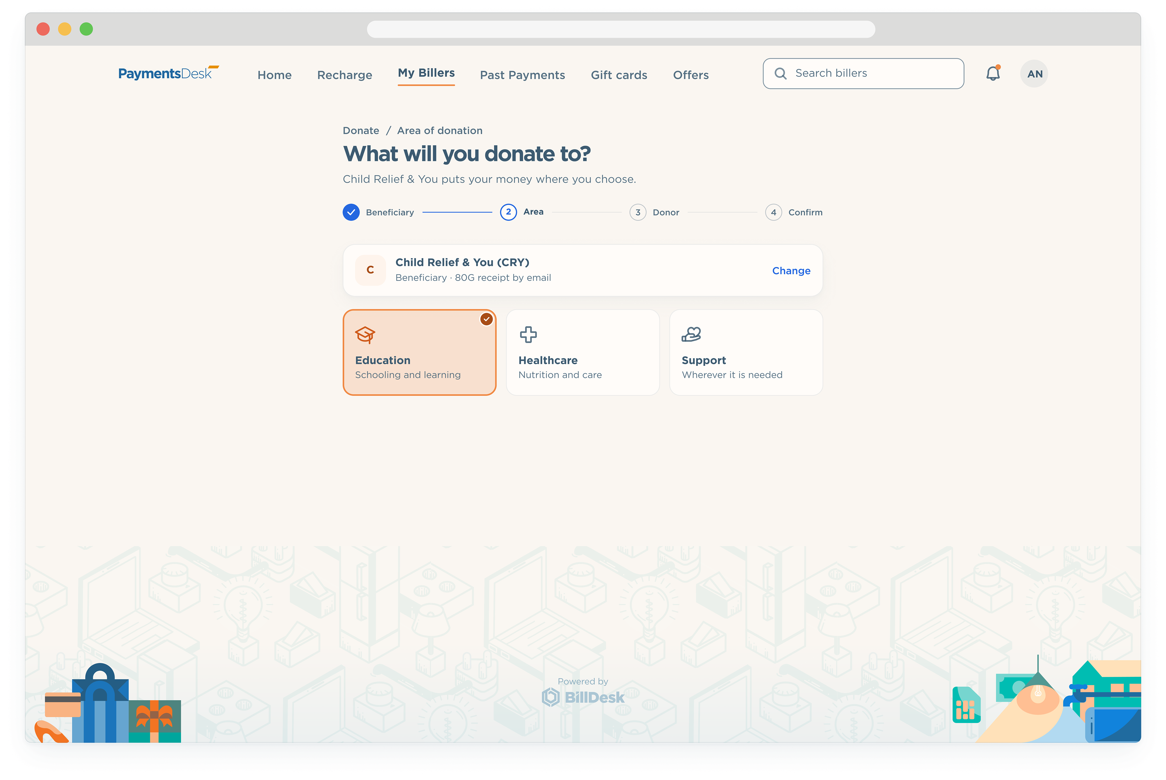
Donations go through Bharat BillPay too. The user picks an organisation from a searchable list, then the area of its work they want to support.
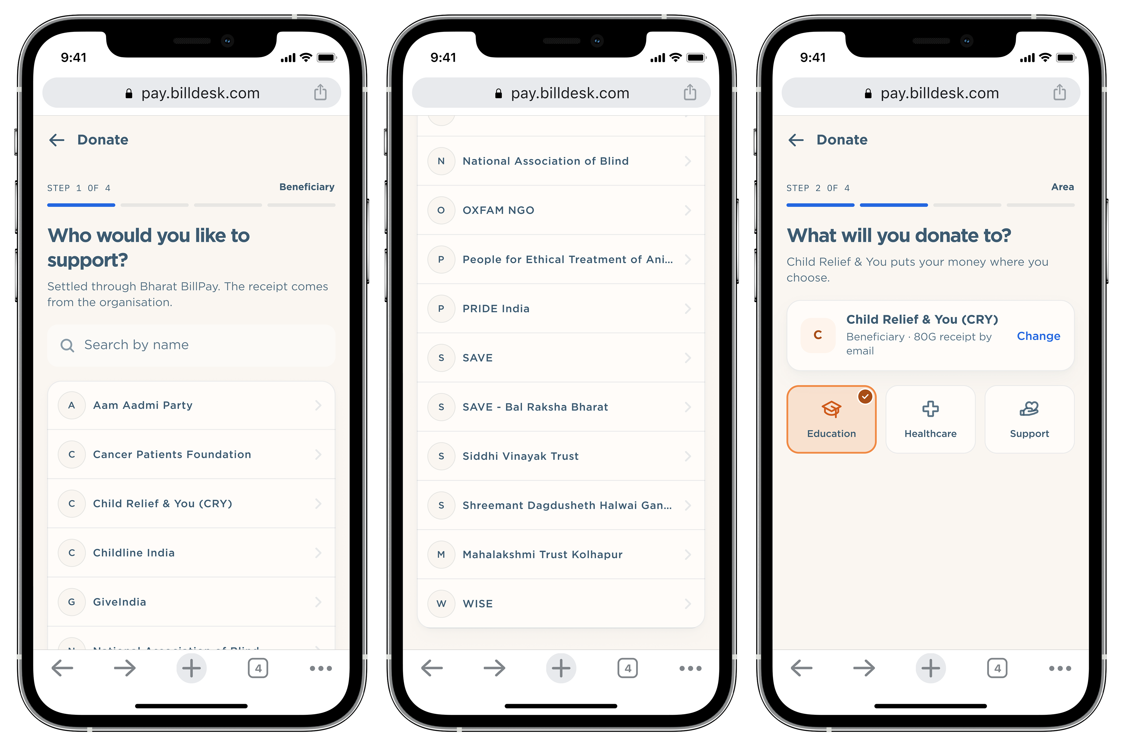
Donate: the beneficiary, then the area.
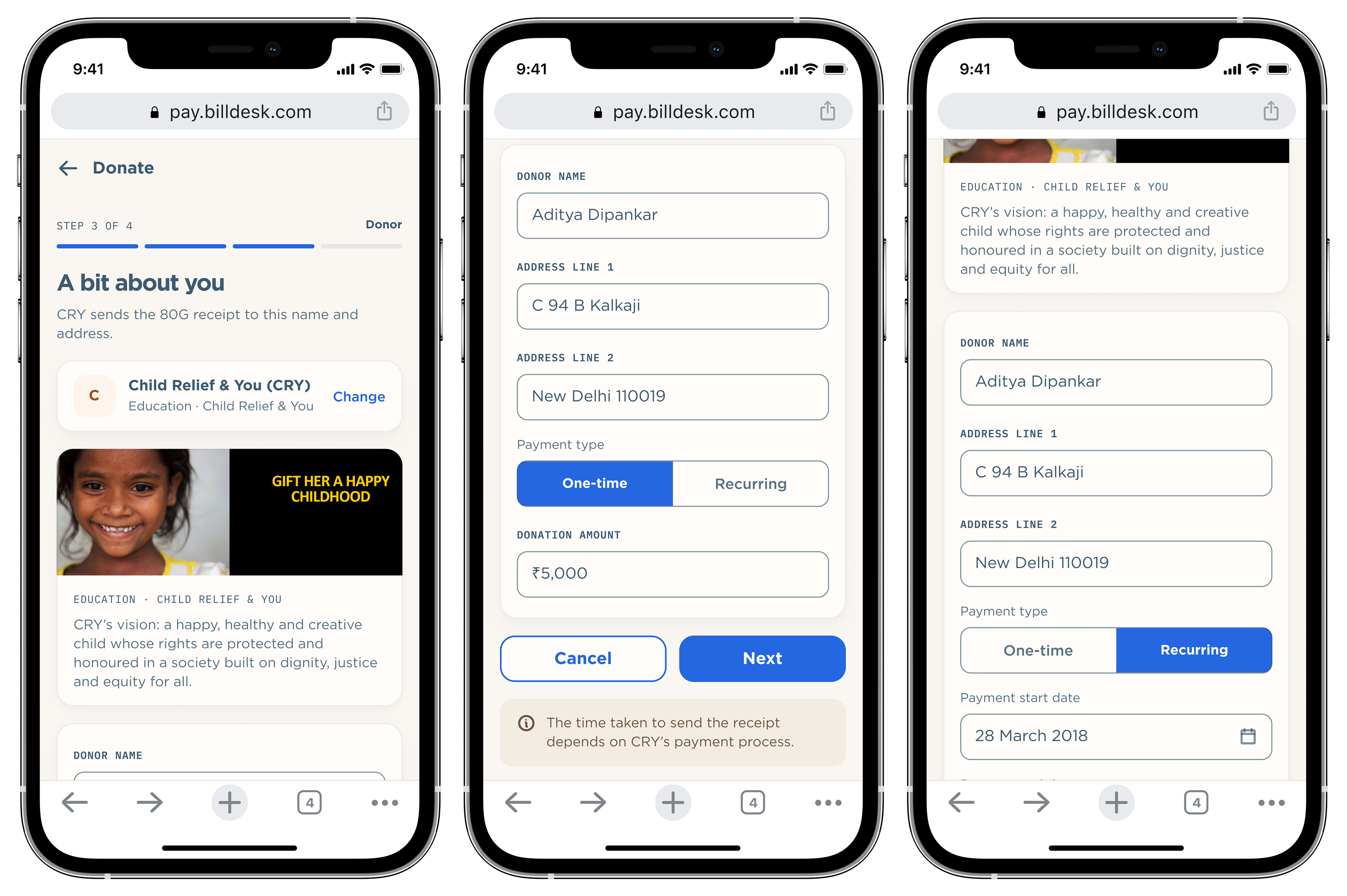
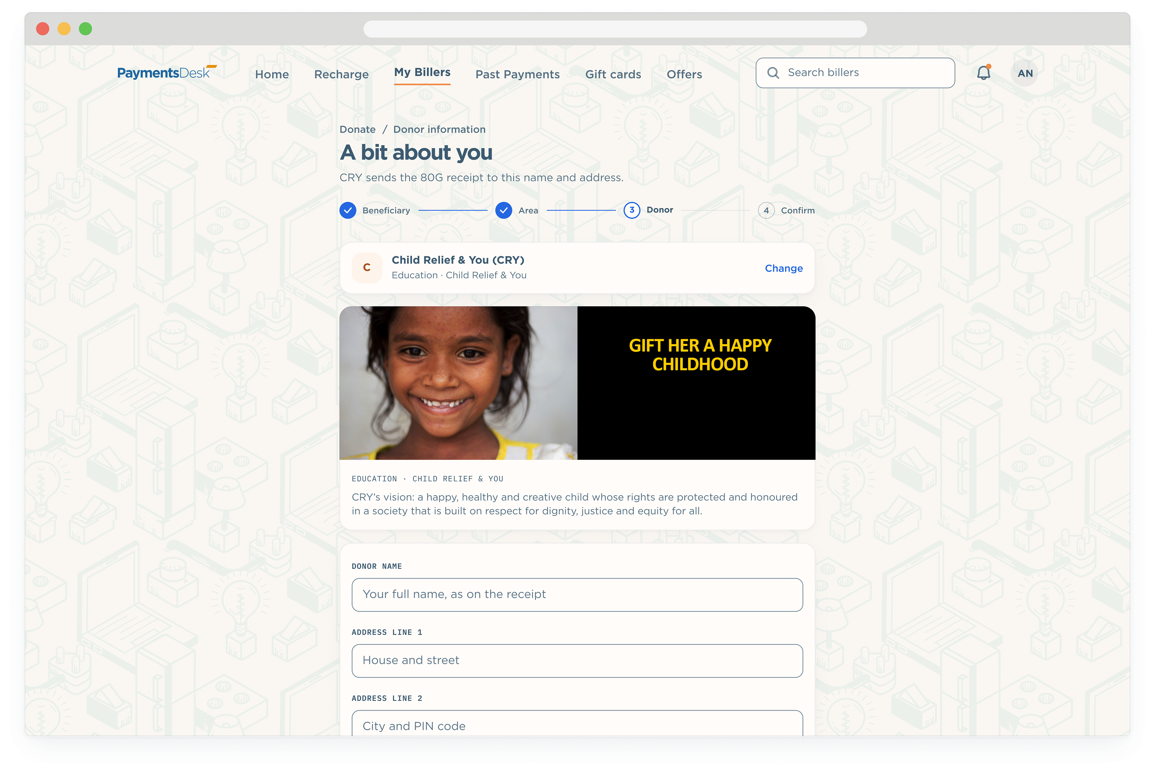
The donor’s name and address go on the 80G tax receipt, so the form asks for them once. A donation can be one-time or recurring, with a start date, an end date and an amount per month.
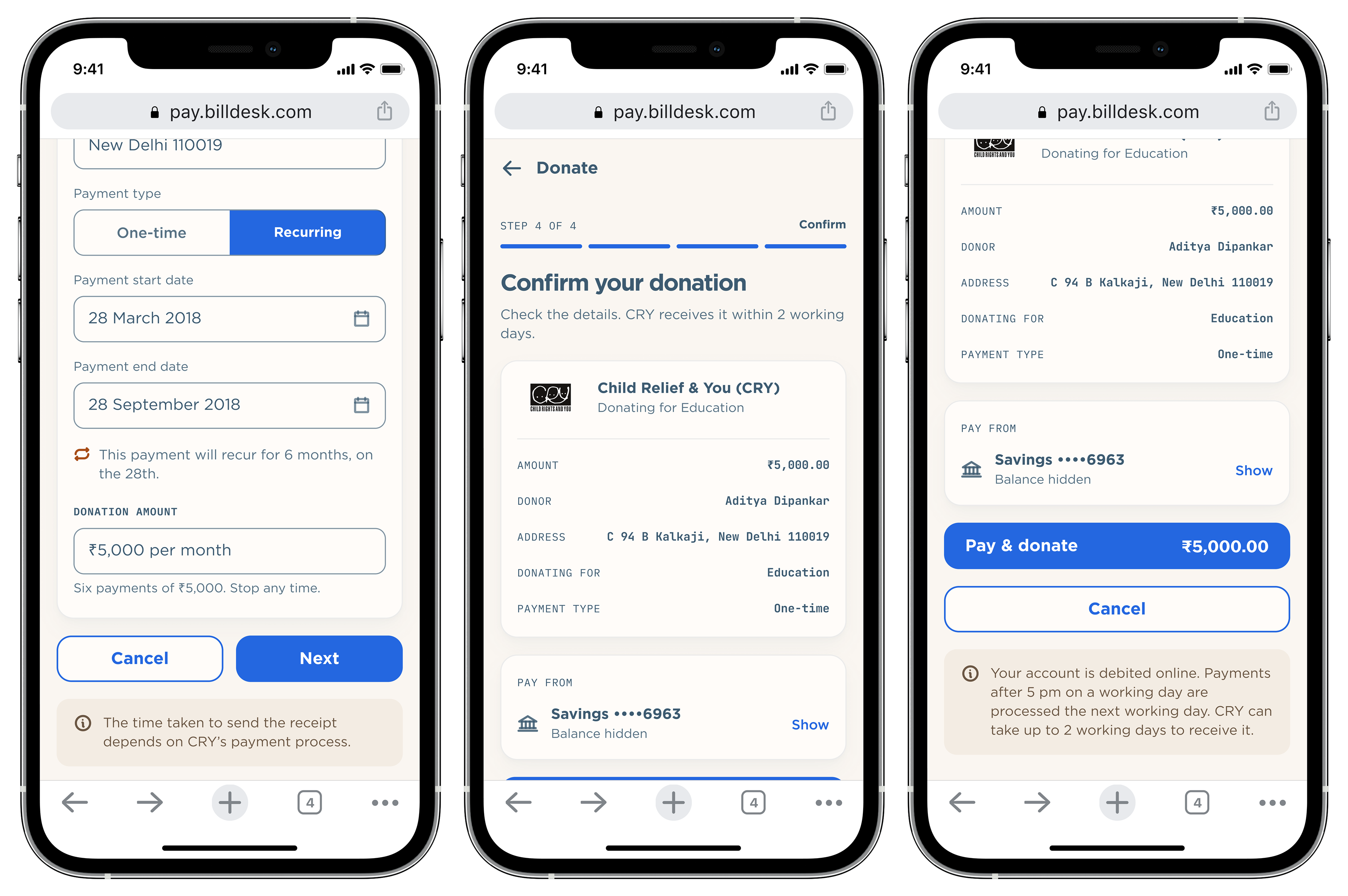
The donor’s name and address go on the 80G tax receipt, so the form asks for them once. A donation can be one-time or recurring, with a start date, an end date and an amount per month.
Ancillary
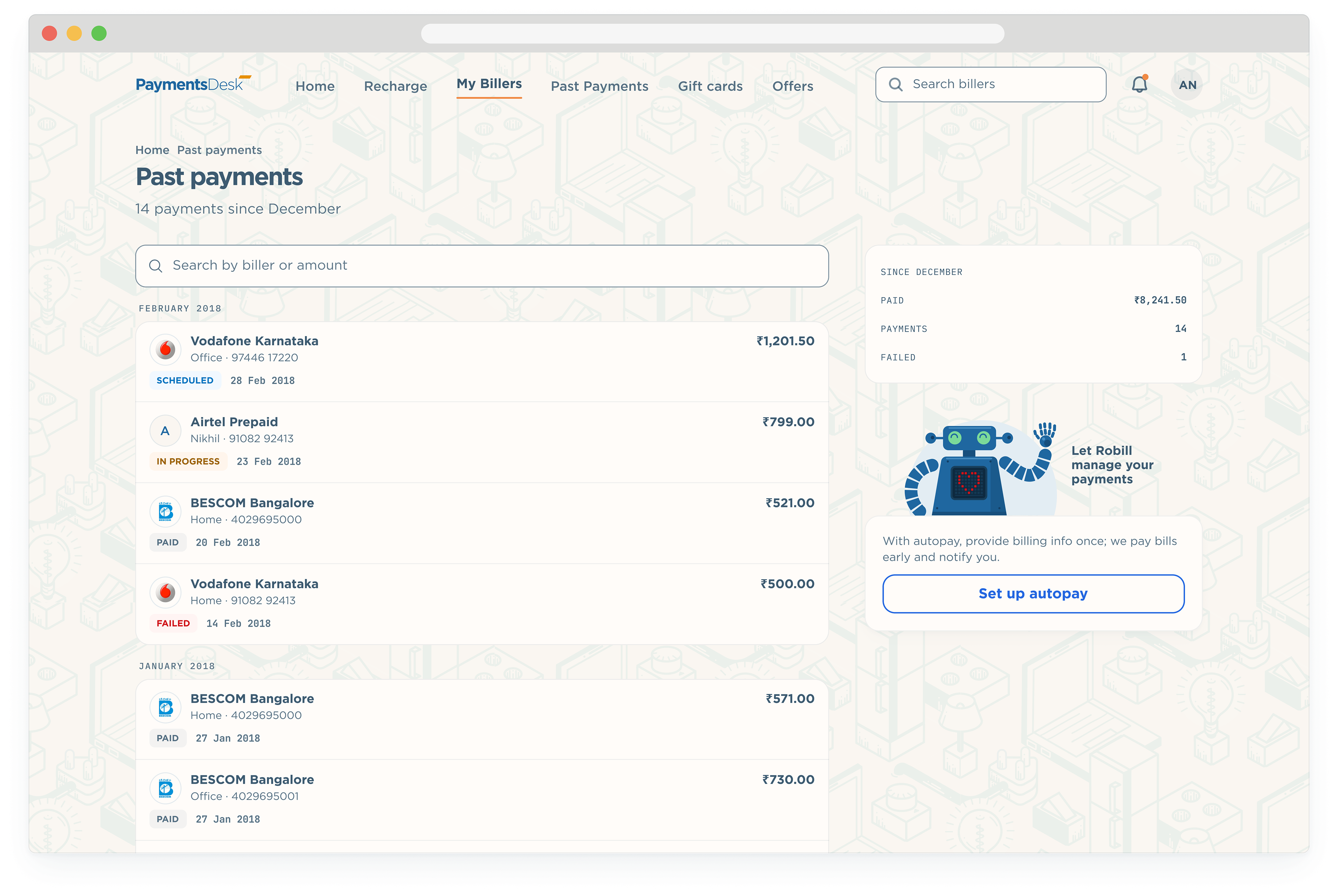
Payments are grouped by month, with a small tracked chip carrying the state so only a failure shouts. Opening one gives the full record, the same card the receipt uses.
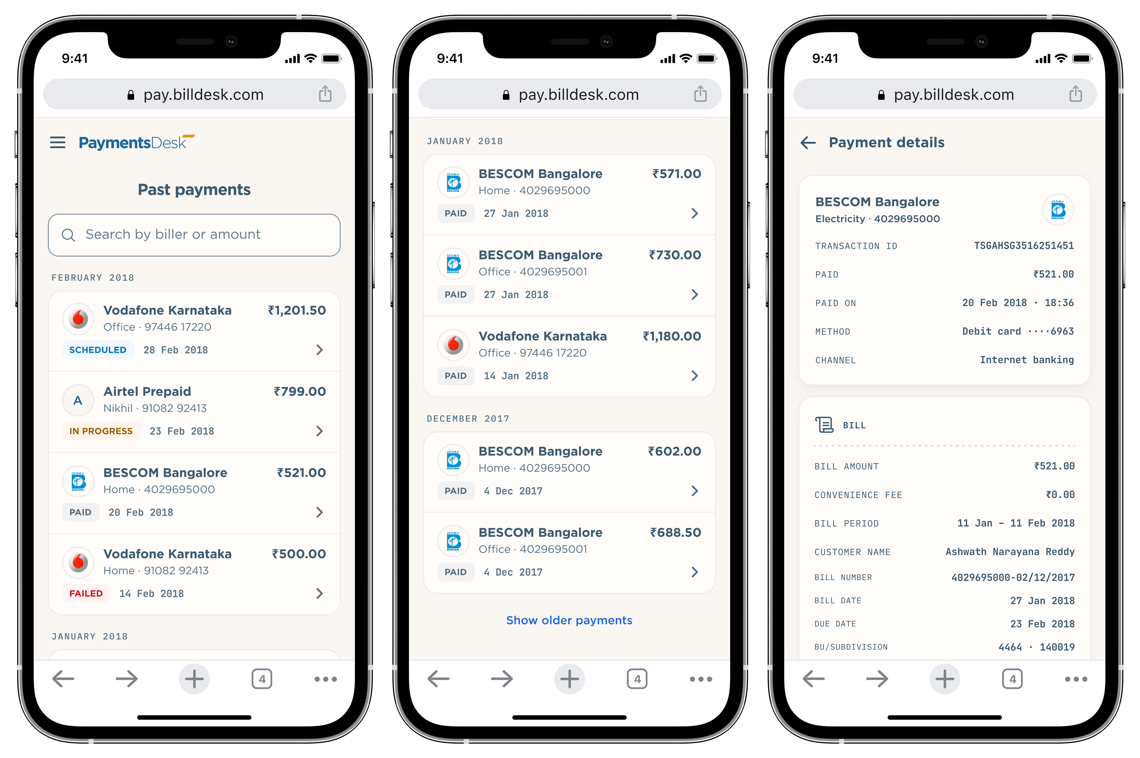
Every payment made here leaves a record, because a bill is only settled when you can show that it was. This is where you come back for a receipt, check whether a scheduled payment went through, or find the reference a biller asks for on the phone.
People come to the desktop to look things up rather than to pay. The list keeps the same rows in the 780 column, and the rail adds what the months come to, so a question about spending is answered without opening anything.
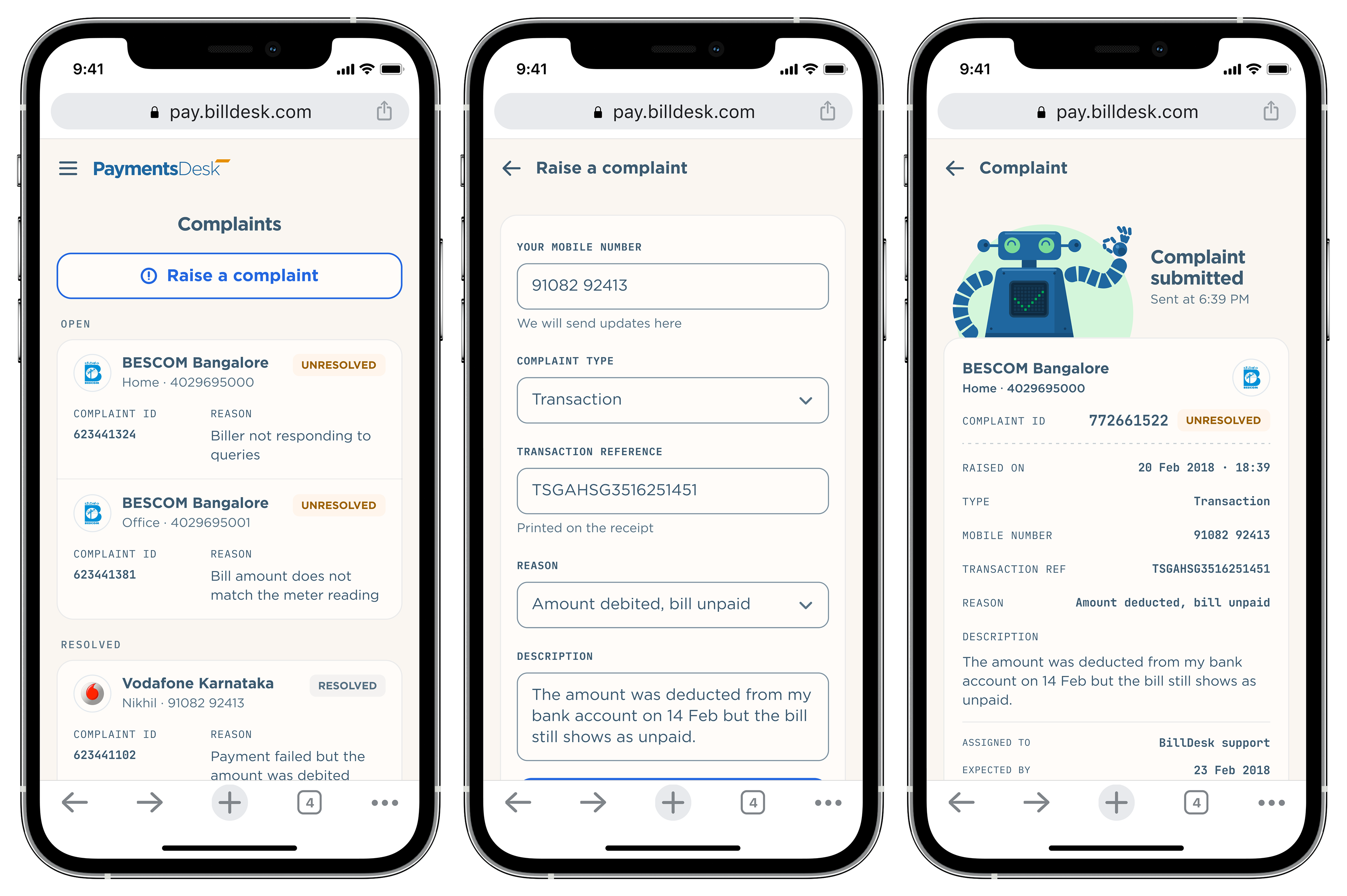
When a payment goes wrong or a biller stops responding, this is how it gets looked at. The complaint travels to Bharat BillPay with the transaction already attached, so nobody has to repeat the details, and the same record shows what has happened since.
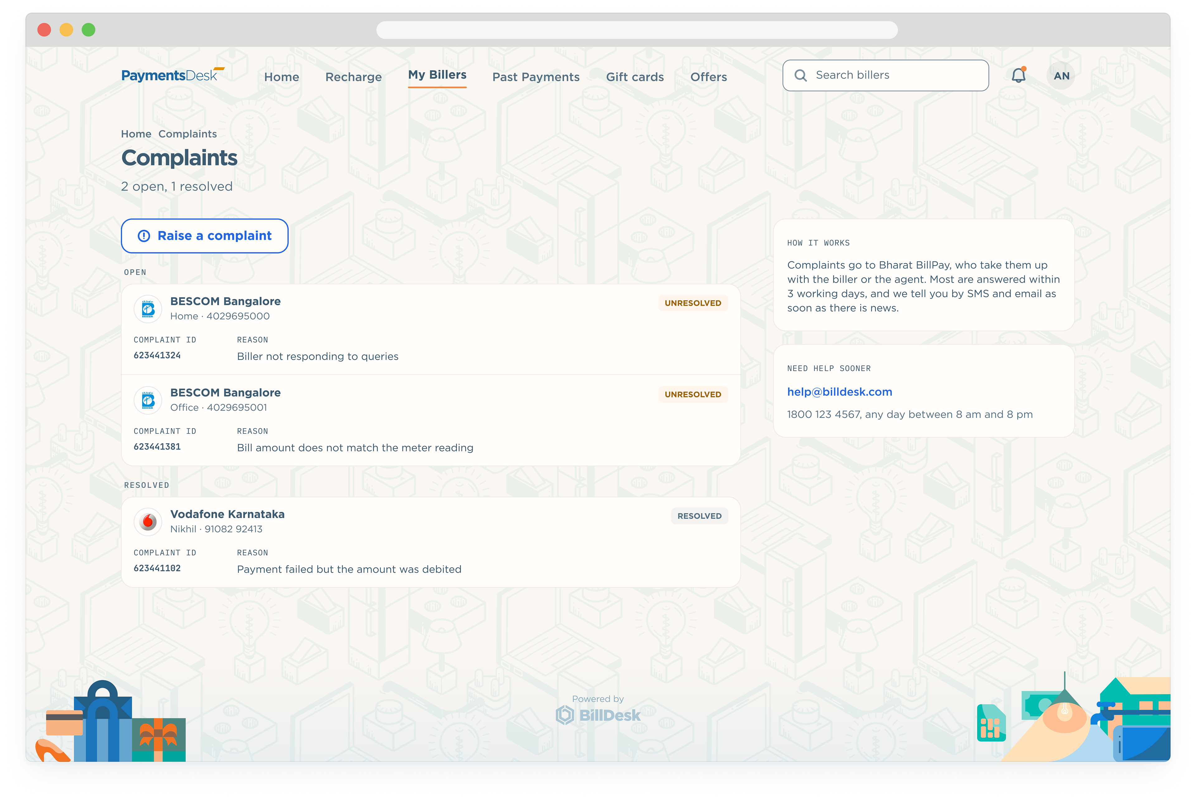
On a wider screen the whole queue can be read at once, open complaints above settled ones. The rail explains where a complaint goes and how to reach a person sooner, which is what anyone raising one wants to know next.
Nobody wants to spend time paying a bill. The brief was to make PaymentsDesk quick, clear and trustworthy for the millions of payments BillDesk handles every day, without making it look like a bank form. Every decision on this page comes back to that: the bill drawn as a bill, the amount and the due date first, one action per screen.